
 Sign in to Mod The Sims
- Site Map >
- Community >
- Sims Discussion >
- Sims 3 >
- Sims 3 Contests >
- Closed Contests >
- Finished - Design This - An Interior Design Contest - FINAL SCORES UP
- Site Map >
- Community >
- Sims Discussion >
- Sims 3 >
- Sims 3 Contests >
- Closed Contests >
- Finished - Design This - An Interior Design Contest - FINAL SCORES UP
#351
 15th Nov 2012 at 10:35 PM
15th Nov 2012 at 10:35 PM
Quote: Originally posted by jones7659
| I count 4? Does the mirror not count as deco? Really not a big deal, just wondering. |
I would assume the mirror doesn't count as it actually serves a purpose being able to use it to skill with and change a Sims' appearance. Not really a decorative item in that sense.
Advertisement

#352
15th Nov 2012 at 10:43 PM
15th Nov 2012 at 10:43 PM
I would agree, just asking because it's in the deco sort in the catelog, though now I'm wondering if it counts towards the skill objects, lol
#353
15th Nov 2012 at 10:56 PM
15th Nov 2012 at 10:56 PM
Quote: Originally posted by ReyaD
|
Thanks for telling us, Volvenom. I'll be sure you aren't docked for points. Just changed that before I saw your post, malibibic! Thanks for reminding me anyway. |
I didn't think, sorry. I should have said earlier.
My youtube videos: http://www.youtube.com/user/TullaRask?feature=mhum
My blog: www.volvenomtullarask.com
#354
16th Nov 2012 at 10:44 PM
16th Nov 2012 at 10:44 PM
ReyaD, could we please get some clarification as to whether or not the mirror counts as one of the skilling objects?
#355
16th Nov 2012 at 11:40 PM
16th Nov 2012 at 11:40 PM
Posts: 1,114
Thanks: 255 in 5 Posts
Of course, Menace. The mirror is NOT counted as a deco item, but thanks to the good points you guys all made, it WILL be counted as a skilling object. : )
Just as an update, one judge is having a busy week and doesn't have all the scores done yet. But they'll be in very soon and then I'll have the scores up. Sorry for the wait.
Just as an update, one judge is having a busy week and doesn't have all the scores done yet. But they'll be in very soon and then I'll have the scores up. Sorry for the wait.
#356
17th Nov 2012 at 3:43 AM
17th Nov 2012 at 3:43 AM
Posts: 383
Thanks: 562 in 3 Posts
Quote: Originally posted by Volvenom
|
I didn't change that fence. Ah I see, the moderators has mistaken that before. The slightly more yellowish color on the fence on my entry comes from the light in the room. I changed the lights to flame |
I originally had the same thing happening in my room as well. I always set my lights to flame, unless it really drastically changes the color scheme of the room.
There is a way around that, by the way, using some dim BuyDebug lights, but I don't like to do that, seems to defeat the purpose most of the time.
#357
17th Nov 2012 at 5:53 AM
17th Nov 2012 at 5:53 AM
Posts: 220
Thanks: 39 in 1 Posts
Eep. Thought I'd be done early for once, but just did a quick recount of my deco objects! Are rugs counted as one like curtains or are they individual? (I have11 deco if individual, 9 if not :S)
#358
17th Nov 2012 at 5:57 AM
17th Nov 2012 at 5:57 AM
Posts: 1,114
Thanks: 255 in 5 Posts
I would personally count rugs as one, just because it's kind of hard to distinguish between them unless you're really paying attention. Same reason I count curtains as only one.
#359
17th Nov 2012 at 5:30 PM
17th Nov 2012 at 5:30 PM
I'm not sure if I'm going to make this round in time.  I went to the computer repair store that has my laptop at the moment today and they still haven't found a replacement fan for it yet!
I really don't want to miss out, but if I do you at least know why now.
 I went to the computer repair store that has my laptop at the moment today and they still haven't found a replacement fan for it yet!
I really don't want to miss out, but if I do you at least know why now.
#360
17th Nov 2012 at 7:42 PM
17th Nov 2012 at 7:42 PM
Quote: Originally posted by Jaguwar
|
I originally had the same thing happening in my room as well. I always set my lights to flame, unless it really drastically changes the color scheme of the room. There is a way around that, by the way, using some dim BuyDebug lights, but I don't like to do that, seems to defeat the purpose most of the time. |
I usually color the lights to make it appear warmer. It colors the ceiling too without me having to actually color it. If I cast the cailing I always end up with white floating tiles I can't get rid of.
My youtube videos: http://www.youtube.com/user/TullaRask?feature=mhum
My blog: www.volvenomtullarask.com
#361
17th Nov 2012 at 8:56 PM
17th Nov 2012 at 8:56 PM
Making a new post for my entry again.
MTSDesignThiscont_Price by Volvenom, on Flickr
MTSDesignThiscont1037 by Volvenom, on Flickr
MTSDesignThiscont1036 by Volvenom, on Flickr
MTSDesignThiscont1033 by Volvenom, on Flickr
MTSDesignThiscont28 by Volvenom, on Flickr
My youtube videos: http://www.youtube.com/user/TullaRask?feature=mhum
My blog: www.volvenomtullarask.com
#362
17th Nov 2012 at 9:55 PM
17th Nov 2012 at 9:55 PM
Posts: 1,114
Thanks: 255 in 5 Posts
If you miss this round, Menace, don't worry about it. You're more than welcome to return for the final round if your computer is back and running by then.
Volvenom, I'll be adding your entry to the chart in a few minutes. Just finishing up the layout for the round 3 scores.
Volvenom, I'll be adding your entry to the chart in a few minutes. Just finishing up the layout for the round 3 scores.
#363
17th Nov 2012 at 10:13 PM
17th Nov 2012 at 10:13 PM
Posts: 1,114
Thanks: 255 in 5 Posts
ROUND 3 SCORES
Individual evaluations:
jones7659
I love the layout of this room – the use of the area behind the fence as a potty/changing area is inspired and would work brilliantly in real life too. I like the colour scheme, but I think that the yellow walls and brown carpet are a bit overpowering together – I think that the walls would’ve looked better if they were cream rather than such a strong yellow. I think that you’ve done an excellent job incorporating the fence into the room and the two cribs also look nice and are in a sensible place.
Nice layout, I love how you placed the cribs. The colour scheme is good, but the yellow doesn't mix with the pink and blue well. The use of that counter as a changing table is very creative, great job.
I think you use too much of yellow and brown color. It is a little unrealistic to have same pattern on the wall, rugs and counter.
SeeMyu
I’m not keen on the layout for this room – the crib and rug look odd placed at angles like that and I think that the short brick fence looks completely out of place. I’m also not a big fan of the colour scheme – the brown wall looks way too dark for a nursery, despite the animal pictures/overlays which do lighten it slightly, and the white floor looks cold and impractical. I do like the blue walls and the idea of using different wall coverings. I don’t think that the fence blends well into the room – the brick fences emphasise how out of place the fence looks. Having said which, it fits well colourwise. The cribs are quite plain but functional and they fit with the colour scheme.
The layout is very creative, but I'm not sure about how effective it would be in terms of Sims navigating. The colour scheme looks quite random, the dark and light wood clash together. The space between the doors and window looks a little empty. I like what you did with the fence though.
I like the blue wall and wall with pattern. Also I like the dark wood furniture with blue color. I dont like black wall. Black is not color for nursery or child room.
sionelle
I love this layout! The separation between the sleeping area and the play area works well and those arches over the cribs look adorable! It looks like it would be very practical, both for sims and in real life. I like the colour scheme; not too bright but not plain and boring, just right for a nursery. Nice use of different floorings to show the divide between the areas too, though I’m not keen on the wooden floor itself. The picket fence fits in brilliantly and the two cribs are a real feature of the room.
Very interesting use of decorations, I like what you did to the cribs. The colour scheme looks a bit random, but the colours don't clash together. The layout is lovely, nice work.
I like this very much. Like the colors u used and how everything works well. You choose pastel colors which are colors for nurseries. very creative what you did with the cribs. Beautiful.
charmedqueen
I quite like the layout of this room. The sleeping area looks a bit cramped to me, but the play area looks great! The way you’ve used blue and pink as accent colours in a green room is a really good idea, but the whole room looks very dark for a nursery, especially the walls in the sleeping corner. The picket fence looks a bit out of place in such a dark room, even though the cribs and a few other things are made of white wood/metal too. The cribs look really nice but, like I said, they are a bit squashed.
The room looks a bit too dark, you could use more lights in it. The colour scheme is a bit too contrasted - dark wood doesn't go well with that shade of green. I'm not sure about the usability of the cribs placed like that though.
I dont like colors you choose. That green wall have too much patterns and not going very well with the blue curtains. Your room looks too dark. Try to use more lighting.
Laserai
I like the layout of this room – it seems very spacious and it’s nice that the twins have a separate play area. I quite like the colour scheme, though it would’ve been nicer if the green was a bit more muted rather than semi-neon. I’m also not keen on the flooring – the puzzle-piece wood looks strange and I think that a green carpet would’ve worked better than the beige one. The fence fits in well in the room with all that white wood and the cribs are functional and fairly nice, though it would’ve been fun to see different patterns or colours for each crib.
The green colour on the windows is a little too bright for a nursery, you could have toned it down a tad. The choice of flooring doesn't go well with the rest of the room. I like how you CAST'ed the wallpaper, it looks lovely.
Colors you choose for the room are nice, but color on windows is too bright and unrealistic. Also, the chair on the wheels are not suitable for kids.
Zoeycuddly183
The layout of this room is OK but there are no clearly defined areas, which means you’re not making the most of the fence. Everything seems a bit all over the place really. The whole room is extremely dark, and the flooring makes it look a bit shabby. The different wall colours (especially the pink and blue walls) look odd to me as there are no clearly defined areas – they look like they’ve been done arbitrarily rather than for any good reason. The fence works well with the colour scheme, but the cribs look rather dull and plain.
You used so many different wallpapers and colours in the room, which makes it look very busy. The flooring doesn't really match the rest of the design and it could use a rug somewhere in the room. The layout is good though.
Layout looks nice. You should use some rugs for "warmer" feeling of the room. I think that the pink pattern does not going very well with the blue and the green pattern. Dont use more than two patterns on the walls.
Jaguwar
I like the layout in this room, though I don’t understand why you did the flooring the way you did instead of confining one flooring to the play corner and using the other for everywhere else. The play corner it cute and works well. I’m not keen on the colour scheme – it looks a bit dark and harsh to me, though the deco you’ve used does help lighten it up and make it more child-friendly. I deducted points for you changing the colour of the fence. It worked well as an area divider but obviously I couldn’t judge how well it fitted with the colour scheme as you changed it – but if you’d left it white it wouldn’t have worked well. The cribs are nicely done patternwise (that’s totally a word, by the way!) and work well as part of the room.
The room looks really cozy, the colour scheme is lovely and the layout is good. I would love a room like that if I was 3 years old again. The green is a little bright on the night table, but I'm guessing it's because of the lighting. Nice work.
Colors you choose are not colors for the nurseries. For the nurseries you should use pastel and light colors. That green is too bright. I like the trains and wooden pattern on the floor.
Amalgam81
I quite like the layout – the little play area is especially cute. The room doesn’t seem to have a colour scheme as such – lots of different colours are used which makes the room look quite cheerful but the wooden flooring is very dark and doesn’t work well in a nursery. I’d normally say I don’t like the puzzle-piece floor but the colours work well here – they really brighten the place up! The fence works well as a room divider but the colour doesn’t fit with the room – using other white wood in the room would’ve helped tie it in. The cribs are done nicely – cute patterns and nice colours. I didn’t dock points for this as it’s not in the rules but I would have loved to see some pictures from sims-eye view inside the room rather than with the walls half up from a distance.
The room could use some more lighting, it looks quite dark now. I like the childish patterns you used, they are perfect for a nursery. The wood on the floor, fence and cribs don't match, so it makes the room look a little chaotic.
I think your room is too dark. You should use some windows or more lights. Your pictures are too small and you cant see the details.
Volvenom
The layout is OK but the sleeping area does look cramped whilst there is lots of empty space in the rest of the room. I’m not keen on the flooring – too busy, even for a nursery. It could’ve worked if it’d been used on a smaller area with a plain carpet for the rest of the room though. The walls are quite dark. The fence matches a few things in the room but not everything, which is a shame, as it makes it look a bit out of place. The cribs are present but it’s a shame they’re not more interesting-looking and they don’t really match the rest of the room!
I like the gerenal look of the room, but the wall and floor colours are a little too dark for a nursery. The blue colour could be a tone or two lighter. The layout is great, nice to know that the cribs are usable. I love curtains and wall decorations, nice work on the room.
I like the layout of the room. I think that floor is too colorful even for the kids. Your walls are too dark for nursery. Paintings you choose are not paintings for nurseries.
Tamlyn
I like the layout – you’ve used the fence well to divide the room and I like the way the different floorings define the areas. I’m not sure about the xylophone in the middle of the floor though – I know that sims can’t, but it looks like a tripping hazard! I like almost all of your colour scheme as it’s bright and cheerful, but the wood panelled walls don’t work for me. Something white/light that would go well with the fence would’ve been better, as the fence works with the whole room with the exception of the walls. The cribs are cute – I like your use of different patterns but the same colours.
The wood on the walls and ceilings looks off - it makes the room look like more of a shack than a nursery. The wallpaper could work better in this case. The layout looks good though, nice use of the decorations.
I think that wooden wall and ceiling is not for nursery. It looks too cold and dark. I dont like color of the curtains and color of the carpet (especially blue,pink green carpet). For nurseries try to use some lighter colors. I like the layout and the shelf with toys.
Daluved1
I like the layout, but the play area looks a bit cramped with so many items crammed in there. The pile of cushions is a nice idea though – shame there wasn’t more space! The sleeping area is nice and spacious. I love the colour scheme – the pink, green and purple work really well and you used them consistently. The walls and flooring also work well in the room. The fence fits really well with the rest of the room and the arch is a cool idea. The cribs are quite nice but they are very simple and it would’ve been nice if they’d not been identical. I docked a point from the rules section as you were (mistakenly) over budget.
I absolutely love the colour scheme, you did a great job on it. The layout and choice of furniture are also great, I would love a room like that IRL even when I'm far too old to have it.
Beautiful. I especially like the zebra rug. I like how everything works together. Great job!
sharill63
I like the layout, it looks very practical but also nice. I like the way you added an extra fence behind one of the cribs and to screen off the potty – that really helped tie the original fence into the room. Shame that the skill toys didn’t fit in the play corner though. I love the colour scheme – it’s light and bright and works brilliantly for a nursery. And the fence fits well with it too. The cribs are OK but perhaps a little dull, good idea to use slightly different colours and patterns (I think? The pictures were blurry) on them.
It's a great room for a girl. I like how you mixed so many colors together without them clashing with each other. The separate fence parts look a little awkward, but in general it's a great layout. Nice job.
I think the colors of the room are too bright and I think that green and purple doesnt go very well together. Your picture are small and overhead picture is blurry.
Buckley
I love the layout! Great idea having a toddler area and an area for a newborn! And it works well with the fence to divide the room too. The only thing I didn’t like was where the potty is, it looked a bit out of place there to me for some reason. The colour scheme is lovely – fairly neutral though I guess inclined towards boys due to the blue, but blue is kind of necessary for a seaside theme so I’d happily have girls in there too. Everything goes well together, including the walls and flooring. The fence works well with the room and I like the little curtain things on it. Very inventive use of different cribs and I love the pattern on the baby’s one.
I love the design very much. The choice of wallpaper is perfect and the colour scheme is great. I think the same cribs could work better and they could be placed somewhere closer together. Otherwise - great entry.
I like this room. Colors are going very well together. Everything looks good. Good job.
Menaceman44
I like the layout – very spacious overall and I like the play corner. There is quite a lot of empty space though and as you had money left from the budget it’s a shame you didn’t put something extra there. Your use of a divider to screen off the potty gave me déjà vu from the last round – it works really well! I’m not keen on the colour scheme though – the floor and wall in the play corner don’t really go with everything else but the play corner does look really cool, and the rest of the room is a little bland. I do love the lights on the cloud wallpaper, I’m totally stealing that idea for one of my sim’s nurseries! The fence doesn’t really match the rest of the room but it is well used to divide the room into a sleeping area and a play area. The cribs are there but they’re a bit boring and it would’ve been nice if they weren’t identical.
I love how you used the partition to hide the potty from the rest of the room. The colour scheme is a bit random, the different wood patterns don't match together well. The room could use some more lights, but besides that it's a nice design.
I like the pattern of light blue wall. I dont think that green go well with the blue. Green carpet and blue wall with the clouds are too bright and doesnt fit in the room.
obviously394
I quite like the layout but I’m not keen on the odd angles that some of the furniture is positioned at. The fence works surprisingly well with those columns, good idea. The feeding/potty area works well but the toys are a bit all over the place. Good use of purple as an accent colour, but it would’ve been nice if you’d used more shades of purple or maybe added some pink and blue as well. It made me laugh when I noticed that the lady and the twins match the colour scheme though! That’s definite dedication to colour coordination! The fence works well with the colour scheme. The cribs are there and I do like the pattern but it’s a shame that they’re identical.
I love the colour scheme, it's matched pretty well. The layout is very interesting and unique. The use of columns in the room is very clever, nice work.
Your colors are too dark and depressive for a child room. Black, dark wood and dark purple not going very well here. For nurseries choose pastel colors, like in th real life.
StardustX
I like the layout, and the curtains to screen off the play area are a great idea. Pity that you didn’t put the skilling toys in that corner too though. I like the fact that the cribs are next to each other, that way the toddlers could interact whilst in their cribs (in real life, that is). I like the colour scheme – it’s soft and muted and is pleasant for a girls’ nursery but not very exciting. The bases of the floor lamps look too bright and garish to me; a brass colour would’ve worked better. Despite being a different colour to all the rest of the wood the fence actually fits in quite well. Shame that the cribs are identical though that does sort of make sense as they’re side by side and both intended for girls.
Very creative use of curtains as hiders, this would be helpful not only in Sims, but in real life too. The choice of walls and floors is interesting and the soft colors fit the room nicely. Good job.
I can see improvement of your work. Colors are nice.If you use curtains on the fence, you should use them on the windows too.
Solventpost
I like the layout, but the toys in the play corner look a bit all over the place – very realistic but not design-friendly! The rug under the potty looks weird as I can see that it sticks through the walls. The room is a little too beige for my liking and I definitely don’t like the colour of the walls (apart from the accent wall, which is lovely). The dark wood is a bit overpowering. The brightly coloured toys in the play corner are nice; it’s a shame that those bright colours aren’t used throughout the room. The fence works well to divide the room but it doesn’t match the colour scheme as all the rest of the wood is very dark. The cribs are very plain but look good against the accent wall. It would’ve been nice if they weren’t identical though.
Nice layout, I like how you placed the furniture. The accented wall is a nice touch to the otherwise plain walls. I'm not sure about the big mirror in the play area, it looks a little unnecessary there. Besides that - great room.
You use too much yellow in the room. The wall, floor and the ceiling in one color is a little too much. Clock are not fitting in the nurseries, it is more a kitchen clock. Area in the fence is too empty.
| Contestant | Judge A | Judge B | Judge C | Total |
|---|---|---|---|---|
| jones 7659 | 47 | 43 | 41 | 43.67 |
| SeeMyu | 38 | 44 | 42 | 41.33 |
| sionelle | 49 | 46 | 48 | 47.67 |
| charmedqueen | 41 | 40 | 37 | 39.33 |
| Laserai | 43 | 41 | 38 | 40.67 |
| King_Deadly | 0 | 0 | 0 | 0 |
| Zoeycuddly183 | 38 | 41 | 40 | 39.67 |
| Jaguwar | 40 | 45 | 39 | 41.33 |
| Amalgam81 | 40 | 42 | 36 | 39.33 |
| Volvenom | 39 | 44 | 41 | 41.33 |
| Tamlyn | 44 | 41 | 42 | 42.33 |
| Daluved1 | 44 | 47 | 48 | 46.33 |
| sharill63 | 48 | 41 | 39 | 42.67 |
| Buckley | 49 | 47 | 47 | 47.67 |
| leriety | 0 | 0 | 0 | 0 |
| Myshia | 0 | 0 | 0 | 0 |
| Menaceman44 | 41 | 45 | 38 | 41.33 |
| obviously394 | 42 | 46 | 38 | 42.00 |
| StardustX | 45 | 45 | 41 | 43.67 |
| Solventpost | 40 | 43 | 36 | 39.67 |
Individual evaluations:
jones7659
| Layout | Requirements | Rule | Colour Scheme | Fun Part | Total | Average | |
|---|---|---|---|---|---|---|---|
| Judge A | 10 | 10 | 10 | 8 | 9 | 47 | |
| Judge B | 7 | 10 10 | 7 | 9 | 43 | ||
| Judge C | 8 | 10 | 10 | 6 | 7 | 41 | 43.67 |
I love the layout of this room – the use of the area behind the fence as a potty/changing area is inspired and would work brilliantly in real life too. I like the colour scheme, but I think that the yellow walls and brown carpet are a bit overpowering together – I think that the walls would’ve looked better if they were cream rather than such a strong yellow. I think that you’ve done an excellent job incorporating the fence into the room and the two cribs also look nice and are in a sensible place.
Nice layout, I love how you placed the cribs. The colour scheme is good, but the yellow doesn't mix with the pink and blue well. The use of that counter as a changing table is very creative, great job.
I think you use too much of yellow and brown color. It is a little unrealistic to have same pattern on the wall, rugs and counter.
SeeMyu
| Layout | Requirements | Rule | Colour Scheme | Fun Part | Total | Average | |
|---|---|---|---|---|---|---|---|
| Judge A | 6 | 10 | 10 | 6 | 6 | 38 | |
| Judge B | 8 | 10 | 10 | 6 | 10 | 44 | |
| Judge C | 8 | 10 | 10 | 7 | 7 | 42 | 41.33 |
I’m not keen on the layout for this room – the crib and rug look odd placed at angles like that and I think that the short brick fence looks completely out of place. I’m also not a big fan of the colour scheme – the brown wall looks way too dark for a nursery, despite the animal pictures/overlays which do lighten it slightly, and the white floor looks cold and impractical. I do like the blue walls and the idea of using different wall coverings. I don’t think that the fence blends well into the room – the brick fences emphasise how out of place the fence looks. Having said which, it fits well colourwise. The cribs are quite plain but functional and they fit with the colour scheme.
The layout is very creative, but I'm not sure about how effective it would be in terms of Sims navigating. The colour scheme looks quite random, the dark and light wood clash together. The space between the doors and window looks a little empty. I like what you did with the fence though.
I like the blue wall and wall with pattern. Also I like the dark wood furniture with blue color. I dont like black wall. Black is not color for nursery or child room.
sionelle
| Layout | Requirements | Rule | Colour Scheme | Fun Part | Total | Average | |
|---|---|---|---|---|---|---|---|
| Judge A | 10 | 10 | 10 | 9 | 10 | 49 | |
| Judge B | 8 | 10 | 10 | 8 | 10 | 46 | |
| Judge C | 9 | 10 | 10 | 10 | 9 | 48 | 47.67 |
I love this layout! The separation between the sleeping area and the play area works well and those arches over the cribs look adorable! It looks like it would be very practical, both for sims and in real life. I like the colour scheme; not too bright but not plain and boring, just right for a nursery. Nice use of different floorings to show the divide between the areas too, though I’m not keen on the wooden floor itself. The picket fence fits in brilliantly and the two cribs are a real feature of the room.
Very interesting use of decorations, I like what you did to the cribs. The colour scheme looks a bit random, but the colours don't clash together. The layout is lovely, nice work.
I like this very much. Like the colors u used and how everything works well. You choose pastel colors which are colors for nurseries. very creative what you did with the cribs. Beautiful.
charmedqueen
| Layout | Requirements | Rule | Colour Scheme | Fun Part | Total | Average | |
|---|---|---|---|---|---|---|---|
| Judge A | 8 | 10 | 10 | 6 | 7 | 41 | |
| Judge B | 6 | 10 | 10 | 6 | 8 | 40 | |
| Judge C | 7 | 10 | 10 | 4 | 6 | 37 | 39.33 |
I quite like the layout of this room. The sleeping area looks a bit cramped to me, but the play area looks great! The way you’ve used blue and pink as accent colours in a green room is a really good idea, but the whole room looks very dark for a nursery, especially the walls in the sleeping corner. The picket fence looks a bit out of place in such a dark room, even though the cribs and a few other things are made of white wood/metal too. The cribs look really nice but, like I said, they are a bit squashed.
The room looks a bit too dark, you could use more lights in it. The colour scheme is a bit too contrasted - dark wood doesn't go well with that shade of green. I'm not sure about the usability of the cribs placed like that though.
I dont like colors you choose. That green wall have too much patterns and not going very well with the blue curtains. Your room looks too dark. Try to use more lighting.
Laserai
| Layout | Requirements | Rule | Colour Scheme | Fun Part | Total | Average | |
|---|---|---|---|---|---|---|---|
| Judge A | 8 | 10 | 10 | 7 | 8 | 43 | |
| Judge B | 7 | 10 | 10 | 6 | 8 | 41 | |
| Judge C | 7 | 10 | 10 | 5 | 6 | 38 | 40.67 |
I like the layout of this room – it seems very spacious and it’s nice that the twins have a separate play area. I quite like the colour scheme, though it would’ve been nicer if the green was a bit more muted rather than semi-neon. I’m also not keen on the flooring – the puzzle-piece wood looks strange and I think that a green carpet would’ve worked better than the beige one. The fence fits in well in the room with all that white wood and the cribs are functional and fairly nice, though it would’ve been fun to see different patterns or colours for each crib.
The green colour on the windows is a little too bright for a nursery, you could have toned it down a tad. The choice of flooring doesn't go well with the rest of the room. I like how you CAST'ed the wallpaper, it looks lovely.
Colors you choose for the room are nice, but color on windows is too bright and unrealistic. Also, the chair on the wheels are not suitable for kids.
Zoeycuddly183
| Layout | Requirements | Rule | Colour Scheme | Fun Part | Total | Average | |
|---|---|---|---|---|---|---|---|
| Judge A | 7 | 10 | 10 | 5 | 6 | 38 | |
| Judge B | 7 | 10 | 10 | 6 | 8 | 41 | |
| Judge C | 7 | 10 | 10 | 6 | 7 | 40 | 39.67 |
The layout of this room is OK but there are no clearly defined areas, which means you’re not making the most of the fence. Everything seems a bit all over the place really. The whole room is extremely dark, and the flooring makes it look a bit shabby. The different wall colours (especially the pink and blue walls) look odd to me as there are no clearly defined areas – they look like they’ve been done arbitrarily rather than for any good reason. The fence works well with the colour scheme, but the cribs look rather dull and plain.
You used so many different wallpapers and colours in the room, which makes it look very busy. The flooring doesn't really match the rest of the design and it could use a rug somewhere in the room. The layout is good though.
Layout looks nice. You should use some rugs for "warmer" feeling of the room. I think that the pink pattern does not going very well with the blue and the green pattern. Dont use more than two patterns on the walls.
Jaguwar
| Layout | Requirements | Rule | Colour Scheme | Fun Part | Total | Average | |
|---|---|---|---|---|---|---|---|
| Judge A | 8 | 10 | 10 | 6 | 6 | 40 | |
| Judge B | 8 | 10 | 10 | 8 | 9 | 45 | |
| Judge C | 7 | 10 | 10 | 6 | 6 | 39 | 41.33 |
I like the layout in this room, though I don’t understand why you did the flooring the way you did instead of confining one flooring to the play corner and using the other for everywhere else. The play corner it cute and works well. I’m not keen on the colour scheme – it looks a bit dark and harsh to me, though the deco you’ve used does help lighten it up and make it more child-friendly. I deducted points for you changing the colour of the fence. It worked well as an area divider but obviously I couldn’t judge how well it fitted with the colour scheme as you changed it – but if you’d left it white it wouldn’t have worked well. The cribs are nicely done patternwise (that’s totally a word, by the way!) and work well as part of the room.
The room looks really cozy, the colour scheme is lovely and the layout is good. I would love a room like that if I was 3 years old again. The green is a little bright on the night table, but I'm guessing it's because of the lighting. Nice work.
Colors you choose are not colors for the nurseries. For the nurseries you should use pastel and light colors. That green is too bright. I like the trains and wooden pattern on the floor.
Amalgam81
| Layout | Requirements | Rule | Colour Scheme | Fun Part | Total | Average | |
|---|---|---|---|---|---|---|---|
| Judge A | 8 | 10 | 10 | 6 | 6 | 40 | |
| Judge B | 7 | 10 | 10 | 7 | 8 | 42 | |
| Judge C | 6 | 10 | 10 | 5 | 5 | 36 | 39.33 |
I quite like the layout – the little play area is especially cute. The room doesn’t seem to have a colour scheme as such – lots of different colours are used which makes the room look quite cheerful but the wooden flooring is very dark and doesn’t work well in a nursery. I’d normally say I don’t like the puzzle-piece floor but the colours work well here – they really brighten the place up! The fence works well as a room divider but the colour doesn’t fit with the room – using other white wood in the room would’ve helped tie it in. The cribs are done nicely – cute patterns and nice colours. I didn’t dock points for this as it’s not in the rules but I would have loved to see some pictures from sims-eye view inside the room rather than with the walls half up from a distance.
The room could use some more lighting, it looks quite dark now. I like the childish patterns you used, they are perfect for a nursery. The wood on the floor, fence and cribs don't match, so it makes the room look a little chaotic.
I think your room is too dark. You should use some windows or more lights. Your pictures are too small and you cant see the details.
Volvenom
| Layout | Requirements | Rule | Colour Scheme | Fun Part | Total | Average | |
|---|---|---|---|---|---|---|---|
| Judge A | 7 | 10 | 10 | 6 | 6 | 39 | |
| Judge B | 8 | 10 | 10 | 8 | 8 | 44 | |
| Judge C | 8 | 10 | 10 | 7 | 7 | 41 | 41.33 |
The layout is OK but the sleeping area does look cramped whilst there is lots of empty space in the rest of the room. I’m not keen on the flooring – too busy, even for a nursery. It could’ve worked if it’d been used on a smaller area with a plain carpet for the rest of the room though. The walls are quite dark. The fence matches a few things in the room but not everything, which is a shame, as it makes it look a bit out of place. The cribs are present but it’s a shame they’re not more interesting-looking and they don’t really match the rest of the room!
I like the gerenal look of the room, but the wall and floor colours are a little too dark for a nursery. The blue colour could be a tone or two lighter. The layout is great, nice to know that the cribs are usable. I love curtains and wall decorations, nice work on the room.
I like the layout of the room. I think that floor is too colorful even for the kids. Your walls are too dark for nursery. Paintings you choose are not paintings for nurseries.
Tamlyn
| Layout | Requirements | Rule | Colour Scheme | Fun Part | Total | Average | |
|---|---|---|---|---|---|---|---|
| Judge A | 8 | 10 | 10 | 8 | 8 | 44 | |
| Judge B | 7 | 10 | 10 | 6 | 8 | 41 | |
| Judge C | 8 | 10 | 10 | 6 | 8 | 42 | 42.33 |
I like the layout – you’ve used the fence well to divide the room and I like the way the different floorings define the areas. I’m not sure about the xylophone in the middle of the floor though – I know that sims can’t, but it looks like a tripping hazard! I like almost all of your colour scheme as it’s bright and cheerful, but the wood panelled walls don’t work for me. Something white/light that would go well with the fence would’ve been better, as the fence works with the whole room with the exception of the walls. The cribs are cute – I like your use of different patterns but the same colours.
The wood on the walls and ceilings looks off - it makes the room look like more of a shack than a nursery. The wallpaper could work better in this case. The layout looks good though, nice use of the decorations.
I think that wooden wall and ceiling is not for nursery. It looks too cold and dark. I dont like color of the curtains and color of the carpet (especially blue,pink green carpet). For nurseries try to use some lighter colors. I like the layout and the shelf with toys.
Daluved1
| Layout | Requirements | Rule | Colour Scheme | Fun Part | Total | Average | |
|---|---|---|---|---|---|---|---|
| Judge A | 7 | 10 | 9 | 10 | 8 | 44 | |
| Judge B | 9 | 10 | 9 | 9 | 10 | 47 | |
| Judge C | 10 | 10 | 9 | 10 | 9 | 48 | 46.33 |
I like the layout, but the play area looks a bit cramped with so many items crammed in there. The pile of cushions is a nice idea though – shame there wasn’t more space! The sleeping area is nice and spacious. I love the colour scheme – the pink, green and purple work really well and you used them consistently. The walls and flooring also work well in the room. The fence fits really well with the rest of the room and the arch is a cool idea. The cribs are quite nice but they are very simple and it would’ve been nice if they’d not been identical. I docked a point from the rules section as you were (mistakenly) over budget.
I absolutely love the colour scheme, you did a great job on it. The layout and choice of furniture are also great, I would love a room like that IRL even when I'm far too old to have it.
Beautiful. I especially like the zebra rug. I like how everything works together. Great job!
sharill63
| Layout | Requirements | Rule | Colour Scheme | Fun Part | Total | Average | |
|---|---|---|---|---|---|---|---|
| Judge A | 9 | 10 | 10 | 10 | 9 | 48 | |
| Judge B | 7 | 10 | 10 | 7 | 7 | 41 | |
| Judge C | 7 | 10 | 10 | 6 | 6 | 39 | 42.67 |
I like the layout, it looks very practical but also nice. I like the way you added an extra fence behind one of the cribs and to screen off the potty – that really helped tie the original fence into the room. Shame that the skill toys didn’t fit in the play corner though. I love the colour scheme – it’s light and bright and works brilliantly for a nursery. And the fence fits well with it too. The cribs are OK but perhaps a little dull, good idea to use slightly different colours and patterns (I think? The pictures were blurry) on them.
It's a great room for a girl. I like how you mixed so many colors together without them clashing with each other. The separate fence parts look a little awkward, but in general it's a great layout. Nice job.
I think the colors of the room are too bright and I think that green and purple doesnt go very well together. Your picture are small and overhead picture is blurry.
Buckley
| Layout | Requirements | Rule | Colour Scheme | Fun Part | Total | Average | |
|---|---|---|---|---|---|---|---|
| Judge A | 9 | 10 | 10 | 10 | 10 | 49 | |
| Judge B | 8 | 10 | 10 | 9 | 10 | 47 | |
| Judge C | 9 | 10 | 10 | 9 | 9 | 47 | 47.67 |
I love the layout! Great idea having a toddler area and an area for a newborn! And it works well with the fence to divide the room too. The only thing I didn’t like was where the potty is, it looked a bit out of place there to me for some reason. The colour scheme is lovely – fairly neutral though I guess inclined towards boys due to the blue, but blue is kind of necessary for a seaside theme so I’d happily have girls in there too. Everything goes well together, including the walls and flooring. The fence works well with the room and I like the little curtain things on it. Very inventive use of different cribs and I love the pattern on the baby’s one.
I love the design very much. The choice of wallpaper is perfect and the colour scheme is great. I think the same cribs could work better and they could be placed somewhere closer together. Otherwise - great entry.
I like this room. Colors are going very well together. Everything looks good. Good job.
Menaceman44
| Layout | Requirements | Rule | Colour Scheme | Fun Part | Total | Average | |
|---|---|---|---|---|---|---|---|
| Judge A | 8 | 10 | 10 | 7 | 6 | 41 | |
| Judge B | 8 | 10 | 10 | 8 | 9 | 45 | |
| Judge C | 7 | 10 | 10 | 6 | 5 | 38 | 41.33 |
I like the layout – very spacious overall and I like the play corner. There is quite a lot of empty space though and as you had money left from the budget it’s a shame you didn’t put something extra there. Your use of a divider to screen off the potty gave me déjà vu from the last round – it works really well! I’m not keen on the colour scheme though – the floor and wall in the play corner don’t really go with everything else but the play corner does look really cool, and the rest of the room is a little bland. I do love the lights on the cloud wallpaper, I’m totally stealing that idea for one of my sim’s nurseries! The fence doesn’t really match the rest of the room but it is well used to divide the room into a sleeping area and a play area. The cribs are there but they’re a bit boring and it would’ve been nice if they weren’t identical.
I love how you used the partition to hide the potty from the rest of the room. The colour scheme is a bit random, the different wood patterns don't match together well. The room could use some more lights, but besides that it's a nice design.
I like the pattern of light blue wall. I dont think that green go well with the blue. Green carpet and blue wall with the clouds are too bright and doesnt fit in the room.
obviously394
| Layout | Requirements | Rule | Colour Scheme | Fun Part | Total | Average | |
|---|---|---|---|---|---|---|---|
| Judge A | 7 | 10 | 10 | 7 | 8 | 42 | |
| Judge B | 8 | 10 | 10 | 9 | 9 | 46 | |
| Judge C | 7 | 10 | 10 | 5 | 6 | 38 | 42.00 |
I quite like the layout but I’m not keen on the odd angles that some of the furniture is positioned at. The fence works surprisingly well with those columns, good idea. The feeding/potty area works well but the toys are a bit all over the place. Good use of purple as an accent colour, but it would’ve been nice if you’d used more shades of purple or maybe added some pink and blue as well. It made me laugh when I noticed that the lady and the twins match the colour scheme though! That’s definite dedication to colour coordination! The fence works well with the colour scheme. The cribs are there and I do like the pattern but it’s a shame that they’re identical.
I love the colour scheme, it's matched pretty well. The layout is very interesting and unique. The use of columns in the room is very clever, nice work.
Your colors are too dark and depressive for a child room. Black, dark wood and dark purple not going very well here. For nurseries choose pastel colors, like in th real life.
StardustX
| Layout | Requirements | Rule | Colour Scheme | Fun Part | Total | Average | |
|---|---|---|---|---|---|---|---|
| Judge A | 8 | 10 | 10 | 9 | 8 | 45 | |
| Judge B | 8 | 10 | 10 | 8 | 9 | 45 | |
| Judge C | 8 | 10 | 10 | 7 | 6 | 41 | 43.67 |
I like the layout, and the curtains to screen off the play area are a great idea. Pity that you didn’t put the skilling toys in that corner too though. I like the fact that the cribs are next to each other, that way the toddlers could interact whilst in their cribs (in real life, that is). I like the colour scheme – it’s soft and muted and is pleasant for a girls’ nursery but not very exciting. The bases of the floor lamps look too bright and garish to me; a brass colour would’ve worked better. Despite being a different colour to all the rest of the wood the fence actually fits in quite well. Shame that the cribs are identical though that does sort of make sense as they’re side by side and both intended for girls.
Very creative use of curtains as hiders, this would be helpful not only in Sims, but in real life too. The choice of walls and floors is interesting and the soft colors fit the room nicely. Good job.
I can see improvement of your work. Colors are nice.If you use curtains on the fence, you should use them on the windows too.
Solventpost
| Layout | Requirements | Rule | Colour Scheme | Fun Part | Total | Average | |
|---|---|---|---|---|---|---|---|
| Judge A | 7 | 10 | 10 | 6 | 7 | 40 | |
| Judge B | 8 | 10 | 10 | 7 | 8 | 43 | |
| Judge C | 6 | 10 | 10 | 5 | 5 | 36 | 39.67 |
I like the layout, but the toys in the play corner look a bit all over the place – very realistic but not design-friendly! The rug under the potty looks weird as I can see that it sticks through the walls. The room is a little too beige for my liking and I definitely don’t like the colour of the walls (apart from the accent wall, which is lovely). The dark wood is a bit overpowering. The brightly coloured toys in the play corner are nice; it’s a shame that those bright colours aren’t used throughout the room. The fence works well to divide the room but it doesn’t match the colour scheme as all the rest of the wood is very dark. The cribs are very plain but look good against the accent wall. It would’ve been nice if they weren’t identical though.
Nice layout, I like how you placed the furniture. The accented wall is a nice touch to the otherwise plain walls. I'm not sure about the big mirror in the play area, it looks a little unnecessary there. Besides that - great room.
You use too much yellow in the room. The wall, floor and the ceiling in one color is a little too much. Clock are not fitting in the nurseries, it is more a kitchen clock. Area in the fence is too empty.
#364
17th Nov 2012 at 10:44 PM
17th Nov 2012 at 10:44 PM
Yay, scores! Sorry for the delay everyone, it was my fault - I was the busy-with-life judge who didn't get them in quickly! Apologies for that, it shouldn't happen again! And kudos for Reya to getting them posted even though she is/was ill! :-D
Now I'm looking forward to seeing everyone's Round 4 entries.... :-) Reya, don't forget to add Amalgam81's Round 4 entry to the table in your original post :-)
Now I'm looking forward to seeing everyone's Round 4 entries.... :-) Reya, don't forget to add Amalgam81's Round 4 entry to the table in your original post :-)
#365
18th Nov 2012 at 12:18 AM
18th Nov 2012 at 12:18 AM
Round Four - Till Death
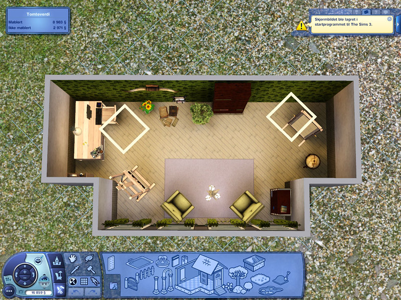
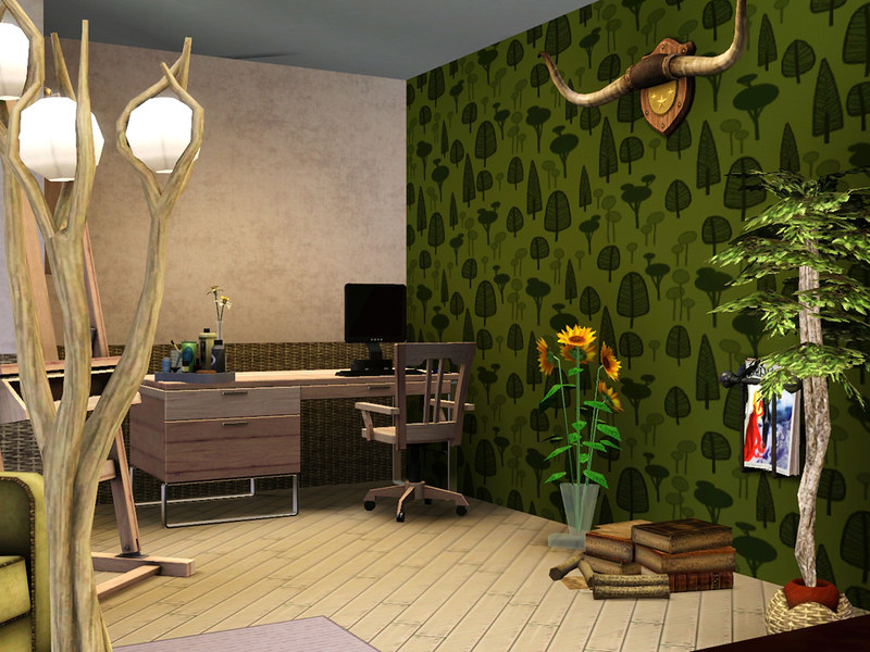
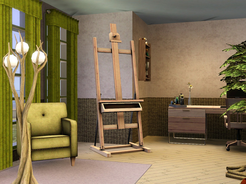
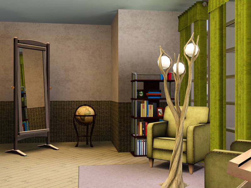
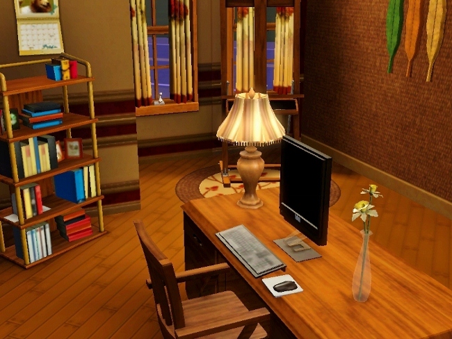
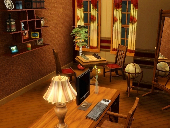
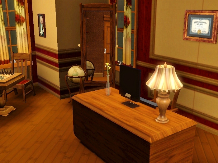
I like my ancestors are fighters till death no matter what the odds are. That said I will be confident to continue to place based on my skill set. I am glad to see I am at least appealing to some. It means that I am not as bad I thought initially. Still, I am seeing that I can still improve my designing skills but such can only take time and experience and I am honestly confident that's not happening during this contest.Anyway, here is my entry into Round Four. I am going with a light natural wood as a base with a little black, gold and white here and there. I suppose this is somewhat of a post modern look. This is probably the longest time I have ever spent on a study.
Usually this room receives minimal attention or even no attention at all. So I did the best I could do with this room. The diagonal touch was interesting to say the least but I think I managed to overcome that little obstacle. Trying to incorporate an accent wall while not choosing one that wouldn't be annoying was probably the hardest for me.
And finally I have incorporated at least 10 deco items:
2 Trees
1 Picture
1 Clock
1 Tissue Box
1 Yellow Flower in Vase (Reqd)
1 Stack of Magazines
1 Standing Mirror (Reqd)
1 Desktop Pen, Pad and Holder
1 Corkboard
1 World Globe (Reqd)
All other pre-set items are also still in the room though I did a lil cast work to help knock down the "ugliness factor"
 especially of the bookshelf. Its a tough sale with that one regardless. Anyway enjoy. I am certain their will be plenty others who will show their overwhelming superiority in upcoming submissions.
#366
18th Nov 2012 at 2:13 AM
18th Nov 2012 at 2:13 AM
Posts: 72
Quote: Originally posted by Laserai
|
...Anyway, here is my entry into Round Four. I am going with a light natural wood as a base with a little black, gold and white here and there. I suppose this is somewhat of a post modern look. This is probably the longest time I have ever spent on a study.
|
I love how you used an arch for the entry to this room! Nice thinking outside the box!

#367
18th Nov 2012 at 2:21 AM
18th Nov 2012 at 2:21 AM
[QUOTE=sharill63]I love how you used an arch for the entry to this room! Nice thinking outside the box!  [/QUOTE
Lasira: Why thank you very much! To be honest, the arch I selected by pure fancy. It wasn't till I get ready to take the picture did I realize how much I liked the initial idea. Still, I think my creativity shines brightest in my writing. My designing work has a little ways to go before I will be confident enough to shameless brag about it. So no worries with me getting the big head anytime soon.
[/QUOTELasira: Why thank you very much! To be honest, the arch I selected by pure fancy. It wasn't till I get ready to take the picture did I realize how much I liked the initial idea. Still, I think my creativity shines brightest in my writing. My designing work has a little ways to go before I will be confident enough to shameless brag about it. So no worries with me getting the big head anytime soon.

#368
18th Nov 2012 at 2:51 AM
18th Nov 2012 at 2:51 AM
Posts: 72
Round 4 - The Study
Hopefully, this is an improvement and shows that I am taking the feedback seriously. Either way, I personally love how this room turned out!
One overhead shot with budget and five "in game" shots.
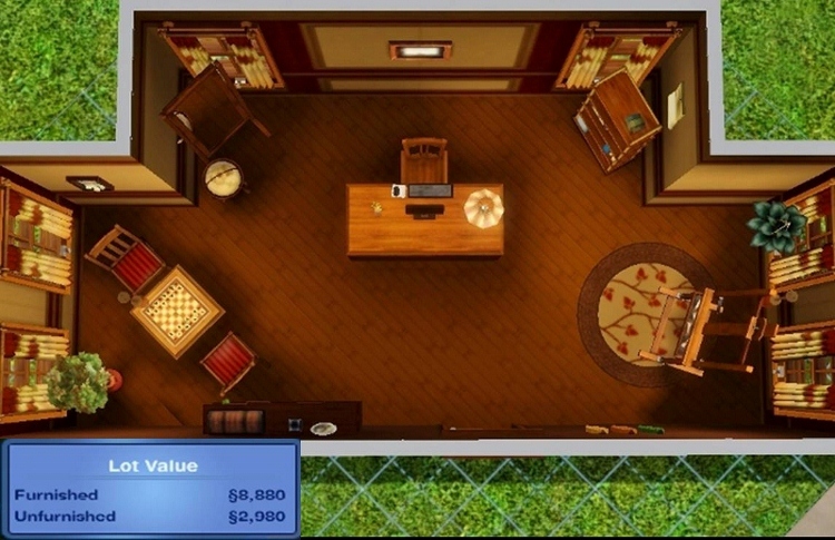
Hopefully, this is an improvement and shows that I am taking the feedback seriously. Either way, I personally love how this room turned out!
One overhead shot with budget and five "in game" shots.
#369
18th Nov 2012 at 5:18 AM
18th Nov 2012 at 5:18 AM
Posts: 1,114
Thanks: 255 in 5 Posts
What? What entry by Amalgam? I already put that one in... >_> (Or at least I will in a few minutes)
To confirm, these are the other entries I'm posting to the chart as well: Sionelle, sharill and Laserai. Did I miss anyone?
To confirm, these are the other entries I'm posting to the chart as well: Sionelle, sharill and Laserai. Did I miss anyone?
#370
18th Nov 2012 at 5:35 AM
18th Nov 2012 at 5:35 AM
Quote: Originally posted by ReyaD
|
What? What entry by Amalgam? I already put that one in... >_> (Or at least I will in a few minutes) To confirm, these are the other entries I'm posting to the chart as well: Sionelle, sharill and Laserai. Did I miss anyone? |
Hehe. Nope, don't think so. And you spotted Sionelle's entry, which I'd missed :-D Apologies if I make no sense. It's 5:30am here, I should probably go to bed....
*Yawns vaguely*
#371
18th Nov 2012 at 10:29 AM
18th Nov 2012 at 10:29 AM
Laserai: I think you did good there. It seems to me like your colors don't crash. Good work
My youtube videos: http://www.youtube.com/user/TullaRask?feature=mhum
My blog: www.volvenomtullarask.com
My youtube videos: http://www.youtube.com/user/TullaRask?feature=mhum
My blog: www.volvenomtullarask.com
#372
19th Nov 2012 at 5:17 AM
19th Nov 2012 at 5:17 AM
Posts: 441
Thanks: 755 in 9 Posts
I promise I didn't copy your arch idea Laserai. xD I didn't see yours was similar until just now.
Well anyways. Here's mine. :3
I did a kind of "beachy" type of theme.
Well anyways. Here's mine. :3
I did a kind of "beachy" type of theme.
#373
19th Nov 2012 at 5:59 AM
19th Nov 2012 at 5:59 AM
Posts: 1,114
Thanks: 255 in 5 Posts
Adding your entry to the chart, Stardust.
#374
19th Nov 2012 at 5:59 PM
19th Nov 2012 at 5:59 PM
Posts: 436
Thanks: 389 in 12 Posts
#375
19th Nov 2012 at 10:39 PM
19th Nov 2012 at 10:39 PM
Here's my entry. At first I wasn't really feeling the Study theme, but I think I came up with something that'll impress the judges. It's a little more subdued and basic than my last few entries.
"Holy Shift! Check out the asymptotes on that mother function!"
"Holy Shift! Check out the asymptotes on that mother function!"
Who Posted
|
|