
 Sign in to Mod The Sims
- Site Map >
- Community >
- Sims Discussion >
- Joint Sims Contests >
- Closed Contests >
- Finished - Picture This! - A mini contest **FINAL SCORES POSTED**
- Site Map >
- Community >
- Sims Discussion >
- Joint Sims Contests >
- Closed Contests >
- Finished - Picture This! - A mini contest **FINAL SCORES POSTED**
Test Subject
#76
 22nd Jan 2012 at 12:30 AM
22nd Jan 2012 at 12:30 AM
Posts: 1
Hello Cold World
Night of the Hunter
Hunting and trapping the monster proved difficult, however, she was determined to locate her sister despite the costs.
Hunting and trapping the monster proved difficult, however, she was determined to locate her sister despite the costs.
Advertisement

#78
22nd Jan 2012 at 8:43 AM
22nd Jan 2012 at 8:43 AM
Ersilya added 
Trae ofc...*gags LadyAwesome* A couple of others who weren't sure whether to join or not because they didn't have a need for the prize said they would donate the prize (if they won) to somebody who did want it....unless ofc you've gotten lazy and want to try for the prize so somebody else can make your poses for a change
Guys, rules are good! Rules help control the fun. ~ Monica E. Geller

Trae ofc...*gags LadyAwesome*
 A couple of others who weren't sure whether to join or not because they didn't have a need for the prize said they would donate the prize (if they won) to somebody who did want it....unless ofc you've gotten lazy and want to try for the prize so somebody else can make your poses for a change
Guys, rules are good! Rules help control the fun. ~ Monica E. Geller
#79
22nd Jan 2012 at 9:33 AM
22nd Jan 2012 at 9:33 AM
#80
22nd Jan 2012 at 10:04 AM
22nd Jan 2012 at 10:04 AM
Traelia:
If you wanna join, please do, but do also read the rules before posting.
Quote:
| DO NOT WRITE USELESS POSTS like "Hey cool contest, I think I might join." Reserve type posts and useless posts about coming back with an application will be deleted. |
Before you ask... It needs moar bushes!
~My landscaping videotutorials~ | ~CFE tiptorial - a set of CFE videos by me~
~My landscaping videotutorials~ | ~CFE tiptorial - a set of CFE videos by me~
#81
23rd Jan 2012 at 1:17 AM
23rd Jan 2012 at 1:17 AM
lunajumper44 Your photo reminds me of Royal Melbourne Children's Hospital... =)
#82
23rd Jan 2012 at 2:05 AM
23rd Jan 2012 at 2:05 AM
Posts: 835
Thanks: 258 in 4 Posts
"2. Photoshopping - You may do any of the following with your image editor: add borders; text; a logo; crop; resize; adjust levels (brightness/contrast); greyscale and sepia. You may not do anything else. If you’re unsure, please ask."
What about Saturation?
What about Saturation?
#83
23rd Jan 2012 at 2:22 AM
23rd Jan 2012 at 2:22 AM
Quote: Originally posted by LadyAwesome
|
"2. Photoshopping - You may do any of the following with your image editor: add borders; text; a logo; crop; resize; adjust levels (brightness/contrast); greyscale and sepia. You may not do anything else. If you’re unsure, please ask." What about Saturation? |
Kayla, contrast and saturation are basically the same thing XD
Just be sure that you won't go crazy with it, so we still be able to see the actual image beneath the shitloads of colors :D
For more Sims 3 stuff by me - visit Ace Creators
My FB Fan page - Elexis's Sims Stuff
My Simblr - ElexisSims
#84
23rd Jan 2012 at 5:15 AM
Last edited by LadyAwesome : 23rd Jan 2012 at 5:59 AM.
23rd Jan 2012 at 5:15 AM
Last edited by LadyAwesome : 23rd Jan 2012 at 5:59 AM.
Posts: 835
Thanks: 258 in 4 Posts
#85
23rd Jan 2012 at 6:15 AM
23rd Jan 2012 at 6:15 AM
LadyAwesome Added
Guys, rules are good! Rules help control the fun. ~ Monica E. Geller
Guys, rules are good! Rules help control the fun. ~ Monica E. Geller
#86
24th Jan 2012 at 3:02 AM
24th Jan 2012 at 3:02 AM
Posts: 1,139
Thanks: 3 in 1 Posts
This was pretty much the first thing that came into my head the moment I saw the song title:
CC: All free items
Edit: Crop and adjusted brightness (original picture was a little dark)
No need to use my full name, "Selly" will do just fine.
Night Of The Hunter

It's the full moon, and tonight Louis is on the prowl... surrounded (as always) by his lupine friends.
It's the full moon, and tonight Louis is on the prowl... surrounded (as always) by his lupine friends.
CC: All free items
Edit: Crop and adjusted brightness (original picture was a little dark)
No need to use my full name, "Selly" will do just fine.
#87
24th Jan 2012 at 12:11 PM
24th Jan 2012 at 12:11 PM
Posts: 220
Thanks: 39 in 1 Posts
Something very simple.
#88
24th Jan 2012 at 8:37 PM
24th Jan 2012 at 8:37 PM
Selly's second entry and Tamlyn added
Guys, rules are good! Rules help control the fun. ~ Monica E. Geller
Guys, rules are good! Rules help control the fun. ~ Monica E. Geller
#89
24th Jan 2012 at 10:51 PM
24th Jan 2012 at 10:51 PM
Posts: 150
Thanks: 2656 in 17 Posts
Here is my second pic, just in time!
I don't even know the song, but the title inspired me... For this picture I used custom clothes, car, skins and hairs (the blonde girl's hair is pay)
"That should be me"
"Once again, she got that she wanted... but why her, WHY ? That should be ME!"
i stret nomo
#90
25th Jan 2012 at 7:38 AM
25th Jan 2012 at 7:38 AM
Added Amylet
Guys, rules are good! Rules help control the fun. ~ Monica E. Geller
Guys, rules are good! Rules help control the fun. ~ Monica E. Geller
#91
26th Jan 2012 at 1:54 AM
26th Jan 2012 at 1:54 AM
There's only a few hours left to get last minute entries in. Due to multiple time zones I made a countdown timer on the first post, please check if you're unsure. Thanks to real life getting in the way I might not manage to be here when the contest officially ends but please be advised that the contest ends when the timer gets to zero, later entries won't be accepted.
Judges, after the countdown timer has stopped feel free to score any entries that come in between now and then even if I haven't linked them yet.
Good Luck everyone
Guys, rules are good! Rules help control the fun. ~ Monica E. Geller
Judges, after the countdown timer has stopped feel free to score any entries that come in between now and then even if I haven't linked them yet.
Good Luck everyone
Guys, rules are good! Rules help control the fun. ~ Monica E. Geller
#92
26th Jan 2012 at 5:57 AM
Last edited by Croutonian : 26th Jan 2012 at 6:07 AM.
Reason: Editing my rambling...
26th Jan 2012 at 5:57 AM
Last edited by Croutonian : 26th Jan 2012 at 6:07 AM.
Reason: Editing my rambling...
Posts: 246
Right...I should really have been able to put these up about 3 hours ago, but young Maxxie Coldruld here (and his deceased parents) decided to really test my patience - his parents seemed rather determined to have him join them in the afterlife and Max decided to get his revenge by smashing their urns! 
And then I came to post them and realised they were a lil too small (I play Sims on a Windows partition on my MacBook, so no print screen key, and I can't get Fraps to work on it ) so had to go restart and resize and eurgh...!
Anyhow... entry numero uno: Hello Cold World

(I messed around greatly with brightness/contrast...but the grain was the in game film grain effect thing - always wanted a reason to try that out!)
And entry two: Poor Misguided Fool

(On this one, other than the obvious border, I again fiddled the brightness/contrast)
I think I used the same hairdo on both sims...but they're different sims...guess I like the hair...
Posted with 2mins left of the contest whew! Bed time.

And then I came to post them and realised they were a lil too small (I play Sims on a Windows partition on my MacBook, so no print screen key, and I can't get Fraps to work on it
 ) so had to go restart and resize and eurgh...!
Anyhow... entry numero uno: Hello Cold World
(I messed around greatly with brightness/contrast...but the grain was the in game film grain effect thing - always wanted a reason to try that out!)
And entry two: Poor Misguided Fool
(On this one, other than the obvious border, I again fiddled the brightness/contrast)
I think I used the same hairdo on both sims...but they're different sims...guess I like the hair...
Posted with 2mins left of the contest whew!
 Bed time.
#93
26th Jan 2012 at 8:06 AM
26th Jan 2012 at 8:06 AM
Croutonian added
We will try to get results to you within the next week. The winner will be required to let us know if they would like TS2 or TS3 poses and preferrably have some reference pics ready (even a drawing would help). Good Luck!
Guys, rules are good! Rules help control the fun. ~ Monica E. Geller
CONTEST IS NOW CLOSED FOR JUDGING
We will try to get results to you within the next week. The winner will be required to let us know if they would like TS2 or TS3 poses and preferrably have some reference pics ready (even a drawing would help). Good Luck!
Guys, rules are good! Rules help control the fun. ~ Monica E. Geller
#94
2nd Feb 2012 at 7:59 AM
2nd Feb 2012 at 7:59 AM
Don't get too excited; it's not the scores! :p
Just wanted to give you an update: Due to a combination of RL getting in the way and underestimating how long it takes to write feedback for 38 images we're taken a little longer than was initially estimated to finish scoring these. I'm hoping we can have results to you (and announce a winner) by Saturday, Sunday at the latest unless there's any major disasters. Sorry about the delay.
Guys, rules are good! Rules help control the fun. ~ Monica E. Geller
#95
2nd Feb 2012 at 8:08 AM
2nd Feb 2012 at 8:08 AM
That's okay =)
#96
2nd Feb 2012 at 8:47 AM
2nd Feb 2012 at 8:47 AM
Posts: 1,114
Thanks: 255 in 5 Posts
Thanks for the update, Roxor. Really appreciate it. So excited for the scores but I'm tryyying to be patient. You guys have one giant list to score.
#97
2nd Feb 2012 at 3:29 PM
2nd Feb 2012 at 3:29 PM
Posts: 3,720
Thanks: 27210 in 66 Posts
Scoring is always more complicated than you originally think. /me points to self...don't I know it! I think the fact that you are taking the time to write feedback for everyone's images is great. Certainly makes waiting easier, knowing that we'll get something besides a number at the end.
Heaven Sims | Avendale Legacy
"On the internet, you can be anything you want. It's strange that so many people choose to be stupid."
"On the internet, you can be anything you want. It's strange that so many people choose to be stupid."
#98
2nd Feb 2012 at 4:20 PM
2nd Feb 2012 at 4:20 PM
Welp, if it counts for anything, I can say that at the very least, one-third of the judging has been completed (cuz I'm done with it ) Things should be wrapped up soon, so just stay patient a little longer guys :D
) Things should be wrapped up soon, so just stay patient a little longer guys :D
#99
2nd Feb 2012 at 9:20 PM
2nd Feb 2012 at 9:20 PM
Posts: 150
Thanks: 2656 in 17 Posts
No problem Missroxor, take your time, I understand that judging 38 pictures represents a lot of work.
And thanks for writing feedback on each one!
And thanks for writing feedback on each one!
#100
4th Feb 2012 at 1:53 AM
4th Feb 2012 at 1:53 AM
Thank-you to all who took part and for waiting patiently while we score. Thanks to my awesome judges for putting in so much effort with the feedback too. Scores were really close in the end so well done to all!
Score - Contestant - Song Title
139.5 - Armiel - Breakout
144.5 - Armiel - Release Me
123.5 - daluved1 - Miss Murder
125.5 - daluved1 - Modern Mafia
125.5 - ReyaD - Miss Murder
122 - ReyaD - Teenage Dream
134.5 - vhanster - My Bloody Valentine
140 - vhanster - Night of the Hunter
129 - Amylet - Miss Murder
127 - Amylet - That Should Be Me
119.5 - ForeverCamp - Modern Mafia
118 - ForeverCamp -Girls Just Wanna Have Fun
143.5 - heaven - That Should Be Me
139 - Liv - Breakout
139 - Misanthrope - Scared of Girls
126 - Florii97 - I will Follow you into the dark
141 - LadyAwesome - Caught Up in the Rapture
133 - LadyAwesome - The Thing That Should Not Be
123 - morena13pt - Poor Misguided Fool
132.5 - morena13pt - I Will Follow You into the Dark
141.5 - wgroome - Moment of Peace
138 - wgroome - Time Honoured Tradition
124 - RomerJon17 - Innocence
142.5 - Buckley - Moment of Peace
130.5 - JuBa_0oo - Witchcraft
124.5 - JuBa_0oo - Innocence
131 - Selly_2009 - Your Biggest Mistake
136.5 - Selly_2009 - Night of the Hunter
135.5 - Waterjay - Innocence
137.5 - Simmer22 - That Should Be Me
133 - Simmer22 - Moment of Peace
122 - lunajumper44 - Born this Way
132 - Ersilya - Hello cold World
122.5 - Ersilya - night of the Hunter
133.5 - Tamlyn - The Drugs Don't Work
130 - Croutonian - Hello Cold World
128 - Croutonian - Poor Misguided Fool
Thank-you to the judges who worked hard at providing feedback. The number at the start of each paragraph is the total score that judge gave you out of 50.
Armiel
Breakout
47.5 - I love the simplicity of this image. It's to the point and gets the idea across effectively. I wasn't really sure why he was barefoot at first but decided that actually it kind of adds to the urgency of the situation, like he didn't have time to stop and think about shoes. Also, I love that you captured him looking back over his shoulder. Fantastic use of in game effects and lighting.
45 - Beautiful, dramatic and dynamic composition with effective use of props (lighting, prison building, etc) Drama could've been made a smidge more intense by creating backlighting with another light source behind the sim. But regardless, the sim definitely has the appearance of an escape convict, and a chill mofo at that. Badass stuff.
47 - Love the dark "grungy" style of this picture; it makes your entry look different and original. It's hard to believe that the prison is CC free, it looks just amazing! The presentation is very clean and minimalistic, but you can get the idea instantly by looking at it. Great job!
Release Me *Winning Image*
47.5 - Another simple but effective image. You created a wonderfully unpleasant environment with the sickly greeny-yellowy tones, skeletal remains and dirty bedding that I think really justifies the desperation etched on his face as he pleads, "Release Me".
47 - The picture is an up-close shot of a prisoner behind bars. The fact that the sim takes up most of the pictorial space makes me focus on his pose and facial expression, both of which scream 'Release me!'. The background isn't too elaborate, but the grungy bed, wall and floor along with the skeleton are more than enough to create a claustrophobic, tense atmosphere.
50 - WOW! Is this really CC and Photoshop free? It looks like a scene from a modern action movie; everything - the scene, the pose, the lighting works amazing for this pic! This is a perfect example that you don't need lots of CC to make an awesome picture, being creative with minimum props is the real key to success and you nailed it
Note from Host: Please let us know what 3 poses you would like for your prize or if you'd like to donate it. PM me or Elexis
Daluved1
Miss Murder
38.5 - I really like the set-up for this pic; even without seeing the sim's face she still manages to come across as sexy and confident. However, other than her blood-red clothes I don't immediately see the link between this scene and the title, “Miss Murder”. Perhaps an image that called for a description.
38 - As the picture wasn't tailor-made to depict a specific scene, it does look more like a showcase of items in the room, with no clear focal points. If more intense, irregular lighting was used, the picture would have delivered a lasting impact and thus become a more impressive composition. The way the scene was set up also made for an ambiguous picture, for there was no victim for this miss murder or any facial expression for the viewer to feel her malice. By not showing the sim's face, however, the picture does hint at the fact that curves can kill, which is a more interesting way of interpreting 'murder'.
47 - Oh my, that pose itself is worth 5/5 points! I love your interpretation of "Miss Murder", it's very subtle, but sexy at the same time. The simple gray background helps to make the scene clearer and helps to concentrate my attention on the scene. Good job!
Modern Mafia
41.5 - Your sim does look confident and powerful sat behind that big desk but I feel like the pose could've been done a little better. Either by repositioning her body in relation to the desk or by choosing a different pose. The fact that your lead is a woman emphasises the "modern" part of the title in my opinion, even if she is an elder since a woman being in such a position of power is very much a modern concept.
39 - Same as your other entry, lighting is the downfall of this composition, as it made the picture rather flat and the focus a little softened. Impact is therefore reduced. The combination of clothing and pose, however, is very appropriate as the sim appears to have both class and power - befitting of a mafia. The 'modern' part of the picture doesn't seem to have been portrayed very clearly though, as this picture's vibe verges between retro and contemporary.
45 - I never thought that elders can look so sexy in Sims 3! She looks like a very powerful and sophisticated woman who gets what she want and that's what I like the most about this picture. Simple background was the perfect way to highlight what's important.
Reya D
Miss Murder
44.5 - This one made me chuckle. I love the way you've portrayed it as murder being such a normal thing for her she's completely at ease with the situation. Outdoor lighting is a pretty poor in TS3 but since most of your background is the house anyway I would've faked being outside and created a room around the sims which gives you control of the lighting. Given your back story and your portrayal of a raven haired beauty with a deadly side; I would've been tempted to go for a bright red bikini top or perhaps some cc reminiscent of a black widow...but that's just me, no points taken off for not doing that, lol.
38 - The picture immediately screams 'Miss Murder' at first look, which is a plus. The basic composition of a stone cold female with a badass bod and a gun, standing behind her sleeping victim is clearly portrayed. The picture seems unpolished (zzz effect still there), which makes it a little less appealing than it could've been.
43 - Very impressive girl: a gun, black hair and some tattoos give her a very mysterious and dangerous look. It would be great if we were able to see her eyes, as I'm sure her face would add even more personality to her character. I'm not a fan of those "Zz Zz Zz" animations above the guy's face, but it's not a bad thing though.
Teenage Dream
39 - This was quite a sweet scene but I feel like your angle could've been better. As it is currently the pose is wasted since we can't really make out much except a sim's butt. Also, nice work doing the history shots but again It's not immediately clear that it's the same sims since you can't really make out their heads.
39 - My first reaction was 'dawww'. The use of kid pictures of the two sims on the wall is effective and tells a story of their relationship. The candles on both sides of the bed add to the warmth of the scene. Some warmer lighting would've been effective as well. The intention is beautiful; however the composition lacks depth and a lasting effect due to the rather frontal positioning of the camera. Still, an overall cute piece.
44 - It's such a romantic and very well executed scene, reminds me of "Dawson's Creek" which was filled with innocent and sweet teenager's life. The angle of this pic is a little off to me: we can see the girl's butt, but not her face
Vhanster
My Bloody Valentine
48.5 - I love the colouring of the overall pic. There's a lot going on in the background but with it all being similar tones, looking almost greyscale it helps the reds really pop highlighting the important parts of the scene: their romance and love...and then all the blood and destruction. The word "love" on the right (I wasn't sure if it was text you'd added in photoshop or cc) bothered me a little. It just seemed a bit playful and immature; I don't think it fits the serious and sombre mood of the rest of the image.
43 - This is a very meticulously set up picture that closely follows the song title. The use of theme-specific deco items (tilted photo frame, grungy wall, splattered blood) together with the mansionry setting makes for a classy yet menacing scene. The male sim seems to have a gallery of Valentine kills judging by the photos all over the wall, which is a nice touch as there is a narrative behind the scene instead of it being a simple setup. However, the picture suffers from the fact that you probably tried to include so many things the overall composition ended up being too messy and focal points are jumbled up. Cropping the picture more or including fewer items would have made for a more impactful delivery.
43 - Classic vampire love story is always in trend, I love the tragic scene that you chose for this pic. However, lots of bright colored CC is a bit distracting, for example - the word "Love" on the wall looks like it doesn't quite fit with the dark mood of this pic. The same goes with the hearts and picture portraits. Other than that - very impressive entry.
Night of the hunter
48 - Hah, this image was pretty surprising, mostly because I didn't know cc like that existed but it's also a pretty original idea. I would've preferred to have seen your sim looking more engaged in the situation, the outfit and props are great but he looks like he's starring off into the distance...even if I was fairly good at hunting those things I still wouldn't turn my back on them, lol. Love the attention to detail elsewhere.
46 - Another nicely set up scene, this time with a clearer foreground/background separation and depth. Once again, the custom content employed is impeccable, portraying not only the narrative but also the era and genre. This is one of the very few fantasy entries in this contest and that makes it stand a head above the others in terms of interpretation and risk-taking. In addition, the fact that 'the hunter' in this picture could actually be either the male sim or the two dragons makes the whole scene more compelling and suspenseful.
46 - This picture reminds me of the good old movie "Dragonheart" a lot. You have chosen good CC for this picture, the scene is also well made. It would look even better if you have made the hunter hiding in the shadows like the background of the scene is, there's a bit too much light where he stands. In general, it's a very well executed theme.
Amylet
Miss Murder
40 - I like the idea of picking out some objects in blood red to get that bloody feel and the bloody pool is a great idea but since she's already committed the murder (and maybe a second out by the pool) I would like to have seen a little more mess. Maybe signs of a struggle or a puddle of blood/bloody footprints near the dead sim?
44 - This song title, while popular, is also an unknowingly challenging choice. Being overly suggestive, the title more often than not limits the contestant's avenues for exploration and imagination, which in the end results in a rather predictable setup. However, this picture is a very solid one, with the consistent use of red color that connects the different pictorial areas into a fluid composition. Red also suggests both blood and romance, which is quite convenient considering the theme. The main focus, the female predator and her victim are in black, which immediately draws the viewer's attention to the action. The choice of pose is appropriate and adds to the menacing feel of the female character.
45 - Love the pool! The lounge chair is hiding it a bit, I noticed the blood inside only after reading the description. The red light wasn't a necessary detail in my opinion, since the scene looks completed even without it. The girl's look suits the theme just perfect, high heeled boots and a gun is one awesome combination.
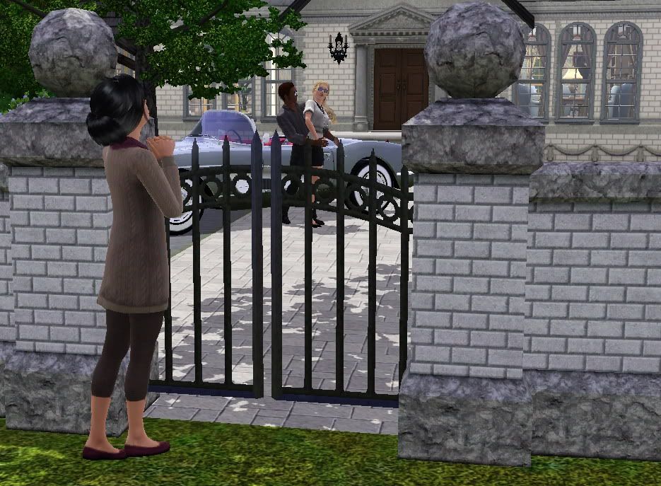
That Should Be Me
40 - For me this image does well in all categories except creativity (which for this contest covers beauty, originality, image layout, use of props, lighting etc). I don't feel like the idea was original enough given it's similarity to an image posted for this title earlier in the contest. Also, the image as a whole is very white/grey, would've been nice to pick out maybe the car or the couple in a vibrant colour to emphasise that is what's caught the girl's attention. Good use of poses and I like that you placed a physical barrier between her and the couple too, adds to the idea that she is on the outside in terms of him being interested.
41 - The idea behind the picture can be seen, and the sims are aptly dressed and posed to suggest their differences. The picture also has considerable depth and composed quite dynamically. However, there seems to be a lack of narration behind the reason why 'that should be her'.
46 - Very well executed scene, it suits the title in it's best way. The fence is hiding some details of the back scene with the rich girl, but that doesn't affect the general look of your pic.
ForeverCamp
Modern Mafia
43.5 - I love the idea of a bunch of high school girls being like the mafia!...I'm just not entirely sure I get why the two are lying on tables? Love all the handbags and very styled hair do's, reminds me of the bitchy popular kids you always see in movies about high school that strut around like they own the place...pretty much like a mini mafia.
34 - There seems to be a good idea behind this picture, considering it's a group of girls dressed in trendy clothes, standing around another laying on the table (the tortured?). However, this idea doesn't seem to have been clearly expressed, as the female sims' poses are rather all over the place, their facial expressions difficult to comprehend. The end product is a confusing composition.
42 - It's a very unusual interpretation of modern mafia, it took me a while to figure it out. The girl in the front blocks the view of the other girl, which makes the scene a bit weird. The empty scene in the window makes the picture look a little incomplete.
Girls Just Wanna Have Fun
43 - Again, another unique and interesting take on your chosen theme. I love the concept but wish the camera was angled differently so we could see the face of at least one of the sims or maybe even looking at the scene side on instead of being stuck at the back. On a side note, your female hairs make me want to play TS2 again! Lol
35 - This picture while having a nice idea behind it, also suffers from the problem of having no defining action that can help viewers understand the setting. The sims seem to be in a football court, with the guys seemingly cheering over a goal they just scored. In the foreground we have a girl. Considering this setup, a title like 'Boys just wanna have fun, with a girl also there just because' would be more appropriate. Overall though, the picture does suggest the fun time, just gotta get your focus right
39 - This picture left me wondering, since I can see one girl and 3 boys in it, the title just didn't quite fit. The weird bent girl's hand looks a bit creepy and the angle isn't showing many details. Despite that, this entry looks different, it's unique and simple and that's what I like about it.
Heaven
That should Be Me
47.5 - Aww, what a sad scene. I love the added details like the history pics that really tell a story and show that it's more than a fleeting crush for the girl at the window. I think I would have liked to have seen the girl in the window's face - not full on, just a bit of side cheek that shows a little of the emotion she was feeling but even without it, it's still a pretty effective image that portrays the theme very well.
47 - This entry is quite similar to another entry (there's only so many ways one can portray this title if you're looking at a romantic situation - why doesn't anyone attempt a 'THE GRIM REAPER IS TAKING MY BROTHER, BUT I SHOULD BE THE ONE TO DIE INSTEAD' or something like that?) but more impressive in terms of delivery. Not only do we have more depth, the skills taken to arrange the scene so that the couple down the front lawn can be seen from the window upstairs, are a level higher than an ordinary shot. The photos on the girl's wall are enough to tell us a backstory of her and that dude, and convincingly shows us how 'that should be her'.
49 - I love this pic, you can get the idea even without looking at the title. Every CC is used in the right way and every little detail reveals something from the life long story. Amazing entry!
Liv
Breakout
48 - I love your take on "Breakout"; was an original idea done well The cc you used was perfect right down to the mussed up hair and glassy eyes. I love the wedding shot too, helps to tell a little of their story. My only bug bear was that I can't help feeling that the image was cropped a little short on the right. Seeing a little of what she's facing -even if it's just some road- I feel would give the viewer a sense of what she was facing by running out (eg if she's staring ahead at the road we might get the sense she has a long journey ahead to be truly free of him or if she's staring at dark woods maybe it would signify she was going into the unknown, willing to risk getting lost than stay another moment with him). Overall job well done!
44 - An interesting entry that shows an intriguing take on the theme of breaking out. In this case, the mother's prison was her home, with an undoubtingly abusive husband - suggested by the scratches on her cheek. This apt setup of a night time scene, with the husband asleep on the sofa while the woman takes her child out the front door successfully delivers the narrative of an escape. The little details such as the wedding photo on the wall and the scratches on the female sim's cheek are also effective. A more expressive facial expression could have been used, however.
47 - It looks like a very sad scene, but it has something bright in it - the breakout means the end of suffering for this woman. I'm amazed of how expressive her eyes look, almost like she was a real person and not a game character. Love the obscure lighting, the wedding picture on the wall and every other little detail that you have showed in this picture.
Misanthrope
Scared of Girls
48 - I can't really fault you on your creativity here, it's a fantastically original take on the theme. I love how you've used colour and lighting to set the atmosphere and the way the red light is just touching the kid's shoes helps portray the idea that "they"/certain death is creeping up on him. The only thing that leaves me wondering is why the kid isn't barricading himself in one of those cubicles (preferably with a blunt object in hand)?! He clearly isn't the sharpest tool in the box, lol. You picked out fantastic CC and the text you chose compliments your theme nicely. Great work!
47 - Can tell it was a lot of fun creating this picture. The setting is gritty and creepy, with every little detail seemingly straight out of a horror movie - from the opened toilet cubicle door, the markings and writings on the wall, the mirror, the ominous red lighting. Even though this could been a really well-done lot made by someone else, the appropriate use of it for this picture is commendable. The zombie nurses are horrifying indeed, with blood all over them while sporting some nice zombie poses. The kid seems terrified and helpless as he should be. Overall a really impactful composition, albeit with a little bit of help from a post-screenshot photo touchup.
44 - I don't know how the girl's restroom can be so neglected and scary, but I guess that's how little boys are imagining it The nurse costumes, in my opinion, don't fit the general theme right, since the main scene is more suitable for school, so school uniforms would make more sense. I couldn't help but notice the Crosshatch sharpen effect, so few points were reduced for this, because Photoshop filtering is not allowed. But didn't affect much, since the picture is very creative and has it's own unique style.
Florii97
I Will follow You into the Dark
42 - I like the concept here but I feel like the high, upside-down angle of the image is a bit awkward. Perhaps a lower angle showing the female’s expression too would've been better? Nice use of colour: I like that the image is largely cold, it helps reiterate your vampiric theme as do the touches of blood red.
41 - The ritual setting is well done, and the shot from above is a refreshing change compared to the other entries (although it only makes sense to do so if we wanna see the dude's face). Coupled with the title, this picture tells a narrative of a guy willingly being turned into a vampire (for the girl) which is quite cute in my opinion. Sorry, creepy romances interest me.
43 - I like this picture, but the weird angle makes it hard to see all important details, such as the blood puddle and the vampire girl's face. Also, the white spiky hair and the smiling guy's face distracts a little too.
Lady Awesome
Caught Up in the Rapture
49 - What a steamy scene! The poses you chose and the angle is perfect; I love that we can see her face and she looks totally focused on him in a really passionate way which is the theme to a tee (I kinda feel like I should look away! lol). The only thing I can nit-pick about this image is that the first text you chose doesn't really suit the theme I don't think, it seems more appropriate for a scary scene than a romantic, passionate one. Also, I like that you picked out a colour from the scene for your text but I would've gone for the soft pink of her lips to signify the passion of the scene (red would probably distract from the main focus of the image).
44 - Oh my, LadyAwesome. Why are you doing this to me? This steamy scene looks straight out of a cheesy 90s movie (or a 90s porn...): wine glasses, animal skin rug, fire place, girl dominating tattooed guy. Which is a compliment, by the way. You definitely got that song title down in style.
48 - What I like the most about this picture is that the Sims you have used have a very unique look. It gives much more realism to the whole picture and it makes it look awesome. The only thing that I'm not fond of, is that you have used 2 fonts for the text, which are not mixing well together (the second one is too casual for the theme).
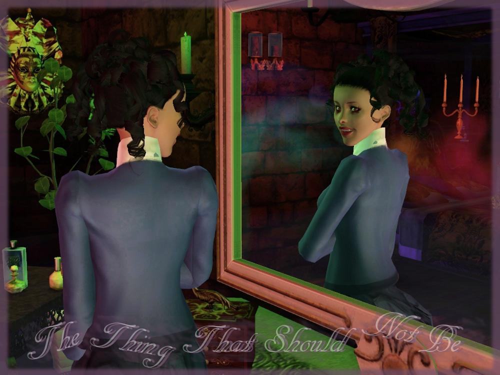
The Thing that Should Not Be
46 - I like the concept here. Maybe I'm just thinking about it too much but it seems to me like you're portraying a normal woman on the left and it's only when you look in the mirror you see there's more to her than meets the eye (though the vampire features are subtle but I can't think of anything you could have done to emphasise that more). The mask on the wall on the left re-iterates that what you see is not always what you get while the red foggy reflection indicates there's something more sinister there. I'm not a fan of your choice of text personally but I can see that it re-iterates the mirrored reflection in-keeping with how you've represented the theme.
41 - I don't quite get everything in the picture, but I think that's the idea. This picture is chilling, composed of 'the things that should not be', with a rather frightening sight of that creepy lady smirking at herself in the mirror. Quite a disturbing scene to be honest, since you can't really read her thoughts. Not sure if that was the intention, but I kinda like it that way.
46 - It is a such well made picture that I just want to put it on the cover for that song. However, gray and sepia would go much better than the bright green lights with the vampire scene.
Poor misguided Fool
37 – A pretty shot but I honestly didn't get that she'd died from drugs until you explained it. Perhaps the same sim and pose in a gritty, grungy alley scene for example might've better shown how far she'd fallen/how much of a fool she's been?
41 - Beautiful picture of a girl happily sleeping in a flower field. Without the extra line below the picture I wouldn't have known she had anything to do with drugs. Aesthetically speaking, this is a very striking and pleasant picture, and without that extra line it could've been understood as the girl being a dreamy fool believing in fairy tales or stuff like that. So now I'm actually quite confused as to whether the delivery has been successful. All in all though, it's still a beautiful picture nonetheless.
45 - It is a very creative way to interpret the title. The picture is very colorful and creates a very happy impression, so I wouldn't have guessed what's the connection between it and the title without reading the description.
I Will follow You into the Dark
47.5 - I love that you applied this title to Romeo & Juliet! The Angel of Darkness is an unexpected addition to the scene but adds weight to the story you're telling with this image. I do feel like you could have brought everything in a little tighter without compromising the scene.
40 - Humorous entry to be honest. Beside the pony-inspired color scheme and fairy tale-like setting with a Romeo and Juliet-esque story, this picture is quite nicely composed with everyone doing their job right: girl dead (while holding onto pony plushie), prince committing suicide by drinking poison and an angel of death (?) lol'ing in the background. I love it.
45 - Somehow the whole "pink and soft" palette isn't going well with the tragic scene. I love how your decorations match each other and I love that Devil in the corner, it gave the needed dark detail to the picture.
wgroome
Moment of Peace
49.5 - There's little I can fault this image for, it made me laugh when I first saw it. I love how all that chaos is happening outside the door and your female sim is totally oblivious and/or bent on tuning it out...wish I had that ability sometimes, lol
44 - Very humorous and nicely laid out picture. The kids and the father and the animals are just having the noisiest time outside while the mother enjoys her relaxing, quiet bath inside. The lighter tones of the bathroom also give it this more tranquil, divine vibe. Moment of peace indeed.
48 - The chaos scene in the front distracted me at first, as I couldn't figure out where the real "moment of peace" is, but then I saw the woman in the bathtub and I got it right away. Your interpretation is very simple, but expressed so right; I love how the picture talks for itself without reading the title. One of my favorite pictures in this contest.
Time honoured Tradition
47 - A very sweet scene - no pun intendedI like that you used an elder to emphasise that the tradition is an old one being passed on to the youngest generation.
43 - Another thoughtful capture. Repetition works beautifully in this picture, as two family members from different generations indulge themselves in the timeless hobby of baking. Succinct, yet packs a lot of punch.
47 - This picture gives me such a warm feeling that I even can't describe it in words. Lovely idea for the picture, lovely scene and lovely title, good job!
RomerJon17
Innocence
34 - As a scene on it's own this image is quite interesting but I had real trouble figuring out the link between the image and the title...I'm still not sure. Perhaps it was just a little too abstract for me, a description/explanation would've helped. I can see how the woman on her own in the darkness looks vulnerable but I feel some of the emotion that could've been portrayed is lost by the fact that we can't see her expression. The pale (by comparison) and simple text compliments the theme well.
46 - Oooooh, my senses are tingling. This quirky picture looks like a promotional poster for a sci-fi Steven Spielberg movie: spooky, mysterious, ominous, yet contains a glimmer of hope. The very linear, proportional setup with a limited palette, and the title in simple sans serif-type font at the bottom altogether make for an almost minimalist composition. The girl, thanks to her skintone, stands out in this dark room. This may suggest a lot of things: Innocence lights up a dark place? Innocence is rare? Innocence is about to be consumed? It might just be me, but I regard this picture very highly.
44 - It's a very unusual interpretation, I needed a few minutes to take a closer look and actually see the scene in the dark. While I like how creative this picture is, I couldn't see the connection between it and the title.
Buckley
Moment of Peace
49.5 - I love how you portrayed this theme! I actually discussed this pic with a friend because I liked it so much and the friend thought that it was not that original since you replicated a real life scene: I couldn’t disagree more. I’m not saying that every contestant should’ve gone out there and done a re-enactment of a real life scene but I like that you did make the connection between the song title and a real life event. I googled the kissing couple to refresh my memory of the scene and you were pretty spot on. I saw that you changed the position of the couple which I think was a smart move, your image flows better than those in the papers (imo). You did a good job of creating a chaotic atmosphere with all the running, yelling and fire in the background but despite the chaos you draw the focus on to the couple with good lighting and they do look totally oblivious to the rioting. Good job all round. It’s a close call at the top for me but I think this image might be my no1.
45 - Very powerful composition. Not often do we see a large scale scene and it pays off in this one, with fire everywhere and firefighters running around and people screaming. It's all very chaotic. And it the middle of all that, in their own little bubble separated from the background (everyone and everything else), we have this passionate couple just gazing at each other. Very smart way of using colors with everyone else either in black or dull tones whereas the main couple have bright hair colors and vibrant clothing.
48 - This picture left me speechless for a moment, as so many memories filled my mind. I remember the original picture very well and I must say, this is such an impressive "Simmified" version of it. Even if the idea is borrowed and I appreciate originality very much, in my opinion this is still a very amazing entry.
Juba_0oo
Witchcraft
43.5 – An interesting take on the theme. I fully expected people to make use of the new magic sets from the store for this title but you’ve taken an unpredictable route with an “under my spell” situation rather than warty noses and pointy black hats Nice poses, I especially like how startled the guy looks to see a mermaid (or maybe at her “extreme beauty”?). I would’ve liked to see a little more beauty in the surrounds I think as it’s a little bland or perhaps a different mermaid pose would have enabled you to get a tighter shot so the girl’s beauty could be more of a focus since you talk about extreme beauty in the description but it’s not very apparent from that distance?
42 - That dude is dead. Apt interpretation of theme in this picture, as everyone knows how the Siren is one of the most prominant femme fatales in ancient mythologies, luring in her preys with her deadly singing. There's not even a hint of menace in this colorful picture, which adds to the actual sense of 'holy !@#$' if the viewer has an idea of what is about to happen to our poor little guy there.
45 - This picture looks so sweet and innocent, that the comment about "long claws and sharp teeth" left me confused. I love mermaids and fairytales and this is a very pretty picture which fits the theme well. However, the mermaid's pose seems to look a bit off, the tail looks huge and too long in that angle, which is very distracting.
Juba_0oo
Innocence
41.5 – It’s definitely a unique idea and kudos for doing an aquarium but I’m not entirely sold on it fitting the theme of innocence. If we take the previous pic into account then yes it makes sense but each picture is judged on its own merit as they are separate entries.
40 - Not as successful as your other entry, but this one is also very promising. Kid is cluelessly looking at the aquarium, having absolutely no idea he's looking at a dangerous, half-naked creature that's not even a fish. If I were his parent, I would've covered his eyes to protect his innocent mind from this M-rated stuff.
43 - It took me a while to see that the Sim in the front is a child, which together with the comment left me confused. I can't see how the child could think from the point you have showed, so the whole picture isn't going well with the title. The water created some visible distortions around the windows which I can't ignore since it's a contest picture. In general, I like this picture, it's very pretty and unusual.
Selly_2009
Your Biggest Mistake
45 – A very tense scene presented well. The title could be referring to him for hitting her or her for staying with him, I like it. The only part I’m not so sure about is the husband’s expression. I can’t tell if he’s supposed to be remorseful or angry...or neither.
42 - Ouch, man, that's not cool. Family violence is still an unsolvable problem today, and it is indeed the biggest mistake should you commit it, for you may destroy the lives of every family member. That has been clearly portrayed here, with the father looking like a total douchebag, mother wounded and in pain, kid heartbroken in the other room. Small details such as the wedding rings and pile of books on the floor did their part and contribute effectively to the narrative.
44 - I can see the title in this picture without reading it, the scene is very clear. It would look even better if there were more lights in the room, as right now it looks a little bit dim. Also, it seems like the whole picture is stretched, as if you were playing in the wrong resolution.
Night of the Hunter
45.5 – I’d almost forgotten about werewolves in TS2, nice take on the theme. His pose is very stalker-ish and I love that you surrounded him with his pack. I think the shot could’ve been better if there was actually a full moon in the background. Also, perhaps some snarly looks from the wolves.
44 - This title seems to encourage fantasy-type of creativity, which is welcomed. This time we have a werewolf and his wolf pack, looking like they're indeed on a hunt. The forest background is very appropriate. Together this piece looks straight out of an 80s werewolf movie. That was the period when werewolf movies were good, by the way.
47 - I love the scene, the whole picture looks very mystical and dangerous. The werewolf's pose is amazing, it just screams how dangerous he is. However, the lighting looks dim again and it makes some details look less clear.
Waterjay
Innocence
47.5 – I know some military folk myself so I should probably be a little offended at the message I think you’re trying to get across here...but that if anything is proof that you successfully expressed your interpretation of the theme. At first glance I assumed the obvious that you are just referring to the victims as innocents but through your title font and description you make it clear that you are either very sympathetic to the average grunt following orders or you’re making a point about ownership of guilt and conscious decision making (I’m going to assume the latter). You did a great job of setting the scene and chose very fitting poses; all of the victims genuinely look terrified! The gunman stood with his back to us emphasises your point that acts committed in the name of war are often perceived as faceless and guilt-free. I would have liked to have seen the expression on the lying down guy’s face but it’s not a huge deal since it’s clear he’s in defensive mode.
43 - Disturbing scene, that's for sure. Even the title 'Innocence' was in camo. It's frightening to know what happens in the picture isn't too far from reality in many parts of the world. I'd imagine this to stir up some serious thoughts if it were an activist poster (I'm not saying it'd stir up any change in people's actions, no. Just thoughts, and then they forget them). Full of sarcasm, but that's exactly what makes this entry a good one.
45 - As I can see that you've choose to represent the "opposite" side of the title, I still can't see how "all" the people in this picture are responsible for war, some of them look like they are innocent for real. The picture itself looks very dark, it looks like there's too much black color. Poses and props blend with the scene well, it's a nice picture in general.
lunajumper44
Born This Way
43 – This is a very sweet scene with great use or props and an uplifting back story. The angle feels a little awkward though; too high and maybe a tad too close.
35 - Very touching backstory behind this picture. However there are a couple issues that prevent it from being as good as it could have been. Items in the room are a little too messy, which detracts from the focal point a little. The poses are rather awkward which makes them seem ambiguous and even disturbing at quick glance (at first I thought she was strangling him). There also too much space above the sims' heads which makes the pictorial space rather imbalanced. Without the text elaboration, it would've been hard to comprehend the picture, while I don't think the picture was intended to be abstract. Overall, with more attention given to composing the picture and giving viewers more visual clues, the piece could've been more successful.
44 - It's such a sweet picture, two kids help each other understand themselves better. It has it's sad side, but the happy faces wash it away and that's why I like this picture - it has a very positive mood. The angle of it is a bit unusual, since we can see only small part of the wheelchair and it's hard to notice the girl's eye.
Ersilya
Hello cold World
45 – I love the post apocalyptic feel and I love the concept (if I’ve interpreted it correctly) that she’s found a little bit of life in an otherwise dead world. Would be nice to see a little more of the world than just that tiny corner though and perhaps a more natural angle...unless the angle is off kilter on purpose to portray the notion that in a post-apocalyptic world, things are not as they should be?
40 - Picture has a very solemn feel to it. The generally dull tones and bare tree add to the overall sense of solitude in the photo. The sim also appears melancholic, which goes well with the overall mood. This looks like the moment where he/she looks at the tree and perhaps the sky and say 'hello cold world' ? Ah, sad indeed. Flowers seem to emit a little bit of hope though. All in all, a nice piece.
47 - I love the color scheme you have used, it shows the "cold" world in a very subtle and specific way. I like the simplicity of the scene, perfect creative angle. Lovely entry.
Ersilya
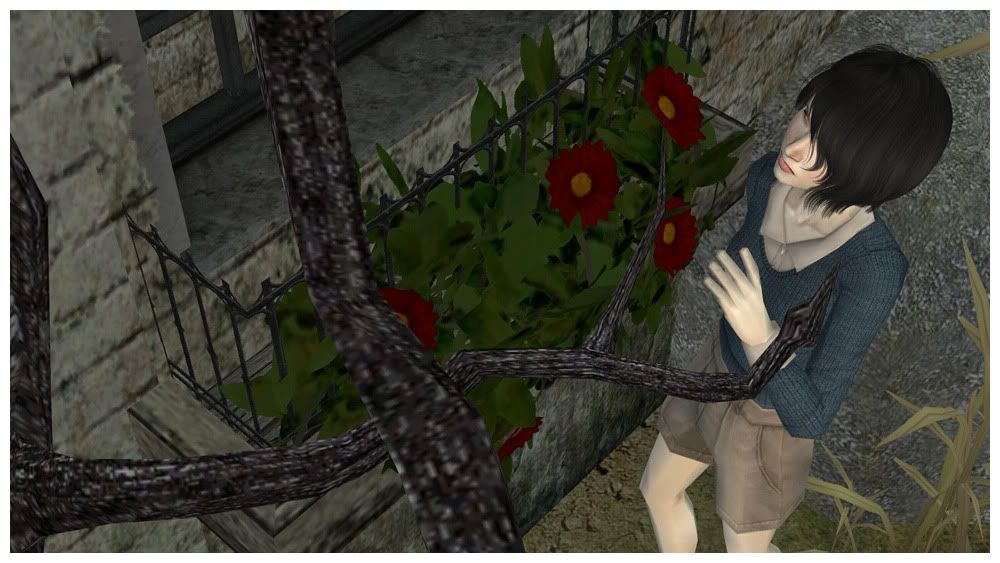
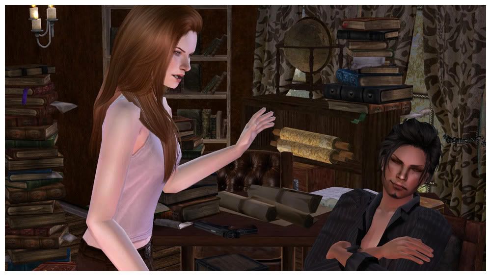
Night of the Hunter
46.5 – I’m a little conflicted by this scene, I love the concept and the guy genuinely looks bad ass but aside from the gun I’m not sure the background is very fitting. It seems like somewhere a fusty old professor would go to read, not a young, mean sister-napper’s hang out. His pose is perfect, I almost want to jump in the scene and give him a good slap myself. Her pose could be a little clearer; I’m not exactly sure if she’s going to hit him or is just having a bit of a hand-waving rant. PS Maybe I have a thing for bad guys but he is hot! :p
32 - First of all, nice background setup with clutters of books and scrolls and maps everywhere. Hunters need these to locate their targets, and the girl needs to find her sister perhaps? Then again scholars read books and regular people have guns too. I don't quite get what locating her sister has to do with 'Night of the hunter', since that title should be the main focus instead of the other way round. It would've been less confusing if the picture was composed along the 'She was determined to locate her sister at all costs, but first she needed to hunt this monster down' line.
44 - It is such a lovely picture, emotions and realism are just flowing through it. However, I wouldn't have guessed what's the connection between the title and the picture without reading the comment. It still reminds me of a family fight more than an actual night of the hunter.
Tamlyn
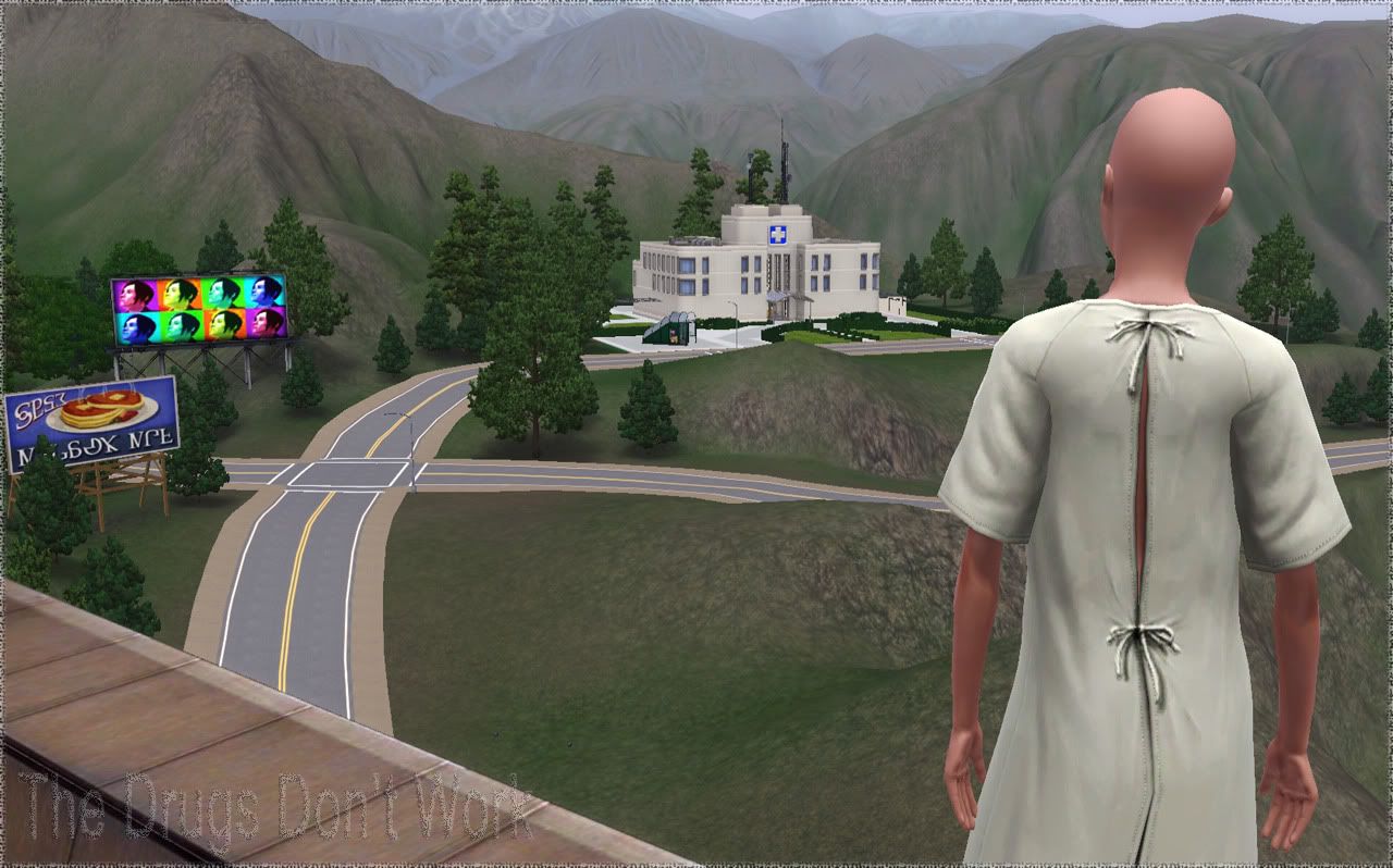
The Drugs don’t Work
47.5 – Very simple but very effective! I love the details like the frayed edges of the picture and fuzzy, barely there text that maybe hint at his state of mind as he’s coming off the drugs. Nice Work!
43 - 'Holy mother of-' was my first thought upon seeing this entry. Very simple indeed, but that's where this picture's brilliance lies. By simply setting the escaped patient on a spot far away looking at the hospital, without any need for custom content, there are already so many things hinted in this picture: 'the drugs don't work' being one and 'I'M GONNA BURN THAT MOTHER$%^&#$%^ HOSPITAL DOWN GUAHAHAHA' being another.
43 - Very nice and simple entry. It's a bit weird to combine it with the title, especially when the man is in a hospital robe and he's only going there (not from there), but otherwise it's a very good picture.
Croutonian
Hello Cold World
46 – Aww, such a sombre scene. Family deaths, final reminders, repo men...I just wanna give the poor guy a hug. Staring out at the bleak landscape as his possessions are hauled away it seems like there’s not even a glimmer of hope. Brilliant take on the theme.
38 - There's a story behind this one. The boy lost both his parents and all that's left with him are a picture of them and a box of things, apprently? It's winter outside. Man, that's lonely. And cold alright. The picture could've been more impactful if the boy's face was shown and he sported a more expressive pose. That sad face emoticon far in the background is a nice touch.
43 - The scene fits the title just perfectly, it's very original and well executed. In my opinion, this picture has amazing potential.
Croutonian
Poor Misguided Fool
48 – This made me LOL. Love the concept and the execution. On any other pic I might think you’d gone overboard with the contrast/brightness but here it gives the pic a kind of cartoonish quality which I think compliments the light-hearted subject matter.
37 - Refreshing and creative attempt, but lacks in delivery. It is a tad difficult to figure out which one the misguided fool is, the plant or the man. At the same time, it's hard to find a narrative in this photo seeing as there's little clues provided in the background.
42 - Very original choice for showing the title. Cow-plants are truly two-faced creatures, your Sim got fooled by it's looks and I think we all know his destiny now
The border was too big in my opinion, it distracts, but in general it's a nice picture.
Guys, rules are good! Rules help control the fun. ~ Monica E. Geller
Final Scores!
(Out of 150 total)
1st Place: Armiel - Release Me
2nd Place: heaven - That Should Be Me
3rd Place: Buckley - Moment of Peace
(Out of 150 total)
1st Place: Armiel - Release Me
2nd Place: heaven - That Should Be Me
3rd Place: Buckley - Moment of Peace
Score - Contestant - Song Title
139.5 - Armiel - Breakout
144.5 - Armiel - Release Me
123.5 - daluved1 - Miss Murder
125.5 - daluved1 - Modern Mafia
125.5 - ReyaD - Miss Murder
122 - ReyaD - Teenage Dream
134.5 - vhanster - My Bloody Valentine
140 - vhanster - Night of the Hunter
129 - Amylet - Miss Murder
127 - Amylet - That Should Be Me
119.5 - ForeverCamp - Modern Mafia
118 - ForeverCamp -Girls Just Wanna Have Fun
143.5 - heaven - That Should Be Me
139 - Liv - Breakout
139 - Misanthrope - Scared of Girls
126 - Florii97 - I will Follow you into the dark
141 - LadyAwesome - Caught Up in the Rapture
133 - LadyAwesome - The Thing That Should Not Be
123 - morena13pt - Poor Misguided Fool
132.5 - morena13pt - I Will Follow You into the Dark
141.5 - wgroome - Moment of Peace
138 - wgroome - Time Honoured Tradition
124 - RomerJon17 - Innocence
142.5 - Buckley - Moment of Peace
130.5 - JuBa_0oo - Witchcraft
124.5 - JuBa_0oo - Innocence
131 - Selly_2009 - Your Biggest Mistake
136.5 - Selly_2009 - Night of the Hunter
135.5 - Waterjay - Innocence
137.5 - Simmer22 - That Should Be Me
133 - Simmer22 - Moment of Peace
122 - lunajumper44 - Born this Way
132 - Ersilya - Hello cold World
122.5 - Ersilya - night of the Hunter
133.5 - Tamlyn - The Drugs Don't Work
130 - Croutonian - Hello Cold World
128 - Croutonian - Poor Misguided Fool
Feedback
Thank-you to the judges who worked hard at providing feedback. The number at the start of each paragraph is the total score that judge gave you out of 50.
Armiel
Breakout
47.5 - I love the simplicity of this image. It's to the point and gets the idea across effectively. I wasn't really sure why he was barefoot at first but decided that actually it kind of adds to the urgency of the situation, like he didn't have time to stop and think about shoes. Also, I love that you captured him looking back over his shoulder. Fantastic use of in game effects and lighting.
45 - Beautiful, dramatic and dynamic composition with effective use of props (lighting, prison building, etc) Drama could've been made a smidge more intense by creating backlighting with another light source behind the sim. But regardless, the sim definitely has the appearance of an escape convict, and a chill mofo at that. Badass stuff.
47 - Love the dark "grungy" style of this picture; it makes your entry look different and original. It's hard to believe that the prison is CC free, it looks just amazing! The presentation is very clean and minimalistic, but you can get the idea instantly by looking at it. Great job!
Release Me *Winning Image*
47.5 - Another simple but effective image. You created a wonderfully unpleasant environment with the sickly greeny-yellowy tones, skeletal remains and dirty bedding that I think really justifies the desperation etched on his face as he pleads, "Release Me".
47 - The picture is an up-close shot of a prisoner behind bars. The fact that the sim takes up most of the pictorial space makes me focus on his pose and facial expression, both of which scream 'Release me!'. The background isn't too elaborate, but the grungy bed, wall and floor along with the skeleton are more than enough to create a claustrophobic, tense atmosphere.
50 - WOW! Is this really CC and Photoshop free? It looks like a scene from a modern action movie; everything - the scene, the pose, the lighting works amazing for this pic! This is a perfect example that you don't need lots of CC to make an awesome picture, being creative with minimum props is the real key to success and you nailed it
Note from Host: Please let us know what 3 poses you would like for your prize or if you'd like to donate it. PM me or Elexis
Daluved1
Miss Murder
38.5 - I really like the set-up for this pic; even without seeing the sim's face she still manages to come across as sexy and confident. However, other than her blood-red clothes I don't immediately see the link between this scene and the title, “Miss Murder”. Perhaps an image that called for a description.
38 - As the picture wasn't tailor-made to depict a specific scene, it does look more like a showcase of items in the room, with no clear focal points. If more intense, irregular lighting was used, the picture would have delivered a lasting impact and thus become a more impressive composition. The way the scene was set up also made for an ambiguous picture, for there was no victim for this miss murder or any facial expression for the viewer to feel her malice. By not showing the sim's face, however, the picture does hint at the fact that curves can kill, which is a more interesting way of interpreting 'murder'.
47 - Oh my, that pose itself is worth 5/5 points! I love your interpretation of "Miss Murder", it's very subtle, but sexy at the same time. The simple gray background helps to make the scene clearer and helps to concentrate my attention on the scene. Good job!
Modern Mafia
41.5 - Your sim does look confident and powerful sat behind that big desk but I feel like the pose could've been done a little better. Either by repositioning her body in relation to the desk or by choosing a different pose. The fact that your lead is a woman emphasises the "modern" part of the title in my opinion, even if she is an elder since a woman being in such a position of power is very much a modern concept.
39 - Same as your other entry, lighting is the downfall of this composition, as it made the picture rather flat and the focus a little softened. Impact is therefore reduced. The combination of clothing and pose, however, is very appropriate as the sim appears to have both class and power - befitting of a mafia. The 'modern' part of the picture doesn't seem to have been portrayed very clearly though, as this picture's vibe verges between retro and contemporary.
45 - I never thought that elders can look so sexy in Sims 3! She looks like a very powerful and sophisticated woman who gets what she want and that's what I like the most about this picture. Simple background was the perfect way to highlight what's important.
Reya D
Miss Murder
44.5 - This one made me chuckle. I love the way you've portrayed it as murder being such a normal thing for her she's completely at ease with the situation. Outdoor lighting is a pretty poor in TS3 but since most of your background is the house anyway I would've faked being outside and created a room around the sims which gives you control of the lighting. Given your back story and your portrayal of a raven haired beauty with a deadly side; I would've been tempted to go for a bright red bikini top or perhaps some cc reminiscent of a black widow...but that's just me, no points taken off for not doing that, lol.
38 - The picture immediately screams 'Miss Murder' at first look, which is a plus. The basic composition of a stone cold female with a badass bod and a gun, standing behind her sleeping victim is clearly portrayed. The picture seems unpolished (zzz effect still there), which makes it a little less appealing than it could've been.
43 - Very impressive girl: a gun, black hair and some tattoos give her a very mysterious and dangerous look. It would be great if we were able to see her eyes, as I'm sure her face would add even more personality to her character. I'm not a fan of those "Zz Zz Zz" animations above the guy's face, but it's not a bad thing though.
Teenage Dream
39 - This was quite a sweet scene but I feel like your angle could've been better. As it is currently the pose is wasted since we can't really make out much except a sim's butt. Also, nice work doing the history shots but again It's not immediately clear that it's the same sims since you can't really make out their heads.
39 - My first reaction was 'dawww'. The use of kid pictures of the two sims on the wall is effective and tells a story of their relationship. The candles on both sides of the bed add to the warmth of the scene. Some warmer lighting would've been effective as well. The intention is beautiful; however the composition lacks depth and a lasting effect due to the rather frontal positioning of the camera. Still, an overall cute piece.
44 - It's such a romantic and very well executed scene, reminds me of "Dawson's Creek" which was filled with innocent and sweet teenager's life. The angle of this pic is a little off to me: we can see the girl's butt, but not her face
Vhanster
My Bloody Valentine
48.5 - I love the colouring of the overall pic. There's a lot going on in the background but with it all being similar tones, looking almost greyscale it helps the reds really pop highlighting the important parts of the scene: their romance and love...and then all the blood and destruction. The word "love" on the right (I wasn't sure if it was text you'd added in photoshop or cc) bothered me a little. It just seemed a bit playful and immature; I don't think it fits the serious and sombre mood of the rest of the image.
43 - This is a very meticulously set up picture that closely follows the song title. The use of theme-specific deco items (tilted photo frame, grungy wall, splattered blood) together with the mansionry setting makes for a classy yet menacing scene. The male sim seems to have a gallery of Valentine kills judging by the photos all over the wall, which is a nice touch as there is a narrative behind the scene instead of it being a simple setup. However, the picture suffers from the fact that you probably tried to include so many things the overall composition ended up being too messy and focal points are jumbled up. Cropping the picture more or including fewer items would have made for a more impactful delivery.
43 - Classic vampire love story is always in trend, I love the tragic scene that you chose for this pic. However, lots of bright colored CC is a bit distracting, for example - the word "Love" on the wall looks like it doesn't quite fit with the dark mood of this pic. The same goes with the hearts and picture portraits. Other than that - very impressive entry.
Night of the hunter
48 - Hah, this image was pretty surprising, mostly because I didn't know cc like that existed but it's also a pretty original idea. I would've preferred to have seen your sim looking more engaged in the situation, the outfit and props are great but he looks like he's starring off into the distance...even if I was fairly good at hunting those things I still wouldn't turn my back on them, lol. Love the attention to detail elsewhere.
46 - Another nicely set up scene, this time with a clearer foreground/background separation and depth. Once again, the custom content employed is impeccable, portraying not only the narrative but also the era and genre. This is one of the very few fantasy entries in this contest and that makes it stand a head above the others in terms of interpretation and risk-taking. In addition, the fact that 'the hunter' in this picture could actually be either the male sim or the two dragons makes the whole scene more compelling and suspenseful.
46 - This picture reminds me of the good old movie "Dragonheart" a lot. You have chosen good CC for this picture, the scene is also well made. It would look even better if you have made the hunter hiding in the shadows like the background of the scene is, there's a bit too much light where he stands. In general, it's a very well executed theme.
Amylet
Miss Murder
40 - I like the idea of picking out some objects in blood red to get that bloody feel and the bloody pool is a great idea but since she's already committed the murder (and maybe a second out by the pool) I would like to have seen a little more mess. Maybe signs of a struggle or a puddle of blood/bloody footprints near the dead sim?
44 - This song title, while popular, is also an unknowingly challenging choice. Being overly suggestive, the title more often than not limits the contestant's avenues for exploration and imagination, which in the end results in a rather predictable setup. However, this picture is a very solid one, with the consistent use of red color that connects the different pictorial areas into a fluid composition. Red also suggests both blood and romance, which is quite convenient considering the theme. The main focus, the female predator and her victim are in black, which immediately draws the viewer's attention to the action. The choice of pose is appropriate and adds to the menacing feel of the female character.
45 - Love the pool! The lounge chair is hiding it a bit, I noticed the blood inside only after reading the description. The red light wasn't a necessary detail in my opinion, since the scene looks completed even without it. The girl's look suits the theme just perfect, high heeled boots and a gun is one awesome combination.
That Should Be Me
40 - For me this image does well in all categories except creativity (which for this contest covers beauty, originality, image layout, use of props, lighting etc). I don't feel like the idea was original enough given it's similarity to an image posted for this title earlier in the contest. Also, the image as a whole is very white/grey, would've been nice to pick out maybe the car or the couple in a vibrant colour to emphasise that is what's caught the girl's attention. Good use of poses and I like that you placed a physical barrier between her and the couple too, adds to the idea that she is on the outside in terms of him being interested.
41 - The idea behind the picture can be seen, and the sims are aptly dressed and posed to suggest their differences. The picture also has considerable depth and composed quite dynamically. However, there seems to be a lack of narration behind the reason why 'that should be her'.
46 - Very well executed scene, it suits the title in it's best way. The fence is hiding some details of the back scene with the rich girl, but that doesn't affect the general look of your pic.
ForeverCamp
Modern Mafia
43.5 - I love the idea of a bunch of high school girls being like the mafia!...I'm just not entirely sure I get why the two are lying on tables? Love all the handbags and very styled hair do's, reminds me of the bitchy popular kids you always see in movies about high school that strut around like they own the place...pretty much like a mini mafia.
34 - There seems to be a good idea behind this picture, considering it's a group of girls dressed in trendy clothes, standing around another laying on the table (the tortured?). However, this idea doesn't seem to have been clearly expressed, as the female sims' poses are rather all over the place, their facial expressions difficult to comprehend. The end product is a confusing composition.
42 - It's a very unusual interpretation of modern mafia, it took me a while to figure it out. The girl in the front blocks the view of the other girl, which makes the scene a bit weird. The empty scene in the window makes the picture look a little incomplete.
Girls Just Wanna Have Fun
43 - Again, another unique and interesting take on your chosen theme. I love the concept but wish the camera was angled differently so we could see the face of at least one of the sims or maybe even looking at the scene side on instead of being stuck at the back. On a side note, your female hairs make me want to play TS2 again! Lol
35 - This picture while having a nice idea behind it, also suffers from the problem of having no defining action that can help viewers understand the setting. The sims seem to be in a football court, with the guys seemingly cheering over a goal they just scored. In the foreground we have a girl. Considering this setup, a title like 'Boys just wanna have fun, with a girl also there just because' would be more appropriate. Overall though, the picture does suggest the fun time, just gotta get your focus right
39 - This picture left me wondering, since I can see one girl and 3 boys in it, the title just didn't quite fit. The weird bent girl's hand looks a bit creepy and the angle isn't showing many details. Despite that, this entry looks different, it's unique and simple and that's what I like about it.
Heaven
That should Be Me
47.5 - Aww, what a sad scene. I love the added details like the history pics that really tell a story and show that it's more than a fleeting crush for the girl at the window. I think I would have liked to have seen the girl in the window's face - not full on, just a bit of side cheek that shows a little of the emotion she was feeling but even without it, it's still a pretty effective image that portrays the theme very well.
47 - This entry is quite similar to another entry (there's only so many ways one can portray this title if you're looking at a romantic situation - why doesn't anyone attempt a 'THE GRIM REAPER IS TAKING MY BROTHER, BUT I SHOULD BE THE ONE TO DIE INSTEAD' or something like that?) but more impressive in terms of delivery. Not only do we have more depth, the skills taken to arrange the scene so that the couple down the front lawn can be seen from the window upstairs, are a level higher than an ordinary shot. The photos on the girl's wall are enough to tell us a backstory of her and that dude, and convincingly shows us how 'that should be her'.
49 - I love this pic, you can get the idea even without looking at the title. Every CC is used in the right way and every little detail reveals something from the life long story. Amazing entry!
Liv
Breakout
48 - I love your take on "Breakout"; was an original idea done well
The cc you used was perfect right down to the mussed up hair and glassy eyes. I love the wedding shot too, helps to tell a little of their story. My only bug bear was that I can't help feeling that the image was cropped a little short on the right. Seeing a little of what she's facing -even if it's just some road- I feel would give the viewer a sense of what she was facing by running out (eg if she's staring ahead at the road we might get the sense she has a long journey ahead to be truly free of him or if she's staring at dark woods maybe it would signify she was going into the unknown, willing to risk getting lost than stay another moment with him). Overall job well done! 44 - An interesting entry that shows an intriguing take on the theme of breaking out. In this case, the mother's prison was her home, with an undoubtingly abusive husband - suggested by the scratches on her cheek. This apt setup of a night time scene, with the husband asleep on the sofa while the woman takes her child out the front door successfully delivers the narrative of an escape. The little details such as the wedding photo on the wall and the scratches on the female sim's cheek are also effective. A more expressive facial expression could have been used, however.
47 - It looks like a very sad scene, but it has something bright in it - the breakout means the end of suffering for this woman. I'm amazed of how expressive her eyes look, almost like she was a real person and not a game character. Love the obscure lighting, the wedding picture on the wall and every other little detail that you have showed in this picture.
Misanthrope
Scared of Girls
48 - I can't really fault you on your creativity here, it's a fantastically original take on the theme. I love how you've used colour and lighting to set the atmosphere and the way the red light is just touching the kid's shoes helps portray the idea that "they"/certain death is creeping up on him. The only thing that leaves me wondering is why the kid isn't barricading himself in one of those cubicles (preferably with a blunt object in hand)?! He clearly isn't the sharpest tool in the box, lol. You picked out fantastic CC and the text you chose compliments your theme nicely. Great work!
47 - Can tell it was a lot of fun creating this picture. The setting is gritty and creepy, with every little detail seemingly straight out of a horror movie - from the opened toilet cubicle door, the markings and writings on the wall, the mirror, the ominous red lighting. Even though this could been a really well-done lot made by someone else, the appropriate use of it for this picture is commendable. The zombie nurses are horrifying indeed, with blood all over them while sporting some nice zombie poses. The kid seems terrified and helpless as he should be. Overall a really impactful composition, albeit with a little bit of help from a post-screenshot photo touchup.
44 - I don't know how the girl's restroom can be so neglected and scary, but I guess that's how little boys are imagining it
Florii97
I Will follow You into the Dark
42 - I like the concept here but I feel like the high, upside-down angle of the image is a bit awkward. Perhaps a lower angle showing the female’s expression too would've been better? Nice use of colour: I like that the image is largely cold, it helps reiterate your vampiric theme as do the touches of blood red.
41 - The ritual setting is well done, and the shot from above is a refreshing change compared to the other entries (although it only makes sense to do so if we wanna see the dude's face). Coupled with the title, this picture tells a narrative of a guy willingly being turned into a vampire (for the girl) which is quite cute in my opinion. Sorry, creepy romances interest me.
43 - I like this picture, but the weird angle makes it hard to see all important details, such as the blood puddle and the vampire girl's face. Also, the white spiky hair and the smiling guy's face distracts a little too.
Lady Awesome
Caught Up in the Rapture
49 - What a steamy scene! The poses you chose and the angle is perfect; I love that we can see her face and she looks totally focused on him in a really passionate way which is the theme to a tee (I kinda feel like I should look away! lol). The only thing I can nit-pick about this image is that the first text you chose doesn't really suit the theme I don't think, it seems more appropriate for a scary scene than a romantic, passionate one. Also, I like that you picked out a colour from the scene for your text but I would've gone for the soft pink of her lips to signify the passion of the scene (red would probably distract from the main focus of the image).
44 - Oh my, LadyAwesome. Why are you doing this to me? This steamy scene looks straight out of a cheesy 90s movie (or a 90s porn...): wine glasses, animal skin rug, fire place, girl dominating tattooed guy. Which is a compliment, by the way. You definitely got that song title down in style.
48 - What I like the most about this picture is that the Sims you have used have a very unique look. It gives much more realism to the whole picture and it makes it look awesome. The only thing that I'm not fond of, is that you have used 2 fonts for the text, which are not mixing well together (the second one is too casual for the theme).
The Thing that Should Not Be
46 - I like the concept here. Maybe I'm just thinking about it too much but it seems to me like you're portraying a normal woman on the left and it's only when you look in the mirror you see there's more to her than meets the eye (though the vampire features are subtle but I can't think of anything you could have done to emphasise that more). The mask on the wall on the left re-iterates that what you see is not always what you get while the red foggy reflection indicates there's something more sinister there. I'm not a fan of your choice of text personally but I can see that it re-iterates the mirrored reflection in-keeping with how you've represented the theme.
41 - I don't quite get everything in the picture, but I think that's the idea. This picture is chilling, composed of 'the things that should not be', with a rather frightening sight of that creepy lady smirking at herself in the mirror. Quite a disturbing scene to be honest, since you can't really read her thoughts. Not sure if that was the intention, but I kinda like it that way.
46 - It is a such well made picture that I just want to put it on the cover for that song. However, gray and sepia would go much better than the bright green lights with the vampire scene.
Poor misguided Fool
37 – A pretty shot but I honestly didn't get that she'd died from drugs until you explained it. Perhaps the same sim and pose in a gritty, grungy alley scene for example might've better shown how far she'd fallen/how much of a fool she's been?
41 - Beautiful picture of a girl happily sleeping in a flower field. Without the extra line below the picture I wouldn't have known she had anything to do with drugs. Aesthetically speaking, this is a very striking and pleasant picture, and without that extra line it could've been understood as the girl being a dreamy fool believing in fairy tales or stuff like that. So now I'm actually quite confused as to whether the delivery has been successful. All in all though, it's still a beautiful picture nonetheless.
45 - It is a very creative way to interpret the title. The picture is very colorful and creates a very happy impression, so I wouldn't have guessed what's the connection between it and the title without reading the description.
I Will follow You into the Dark
47.5 - I love that you applied this title to Romeo & Juliet! The Angel of Darkness is an unexpected addition to the scene but adds weight to the story you're telling with this image. I do feel like you could have brought everything in a little tighter without compromising the scene.
40 - Humorous entry to be honest. Beside the pony-inspired color scheme and fairy tale-like setting with a Romeo and Juliet-esque story, this picture is quite nicely composed with everyone doing their job right: girl dead (while holding onto pony plushie), prince committing suicide by drinking poison and an angel of death (?) lol'ing in the background. I love it.
45 - Somehow the whole "pink and soft" palette isn't going well with the tragic scene. I love how your decorations match each other and I love that Devil in the corner, it gave the needed dark detail to the picture.
wgroome
Moment of Peace
49.5 - There's little I can fault this image for, it made me laugh when I first saw it. I love how all that chaos is happening outside the door and your female sim is totally oblivious and/or bent on tuning it out...wish I had that ability sometimes, lol
44 - Very humorous and nicely laid out picture. The kids and the father and the animals are just having the noisiest time outside while the mother enjoys her relaxing, quiet bath inside. The lighter tones of the bathroom also give it this more tranquil, divine vibe. Moment of peace indeed.
48 - The chaos scene in the front distracted me at first, as I couldn't figure out where the real "moment of peace" is, but then I saw the woman in the bathtub and I got it right away. Your interpretation is very simple, but expressed so right; I love how the picture talks for itself without reading the title. One of my favorite pictures in this contest.
Time honoured Tradition
47 - A very sweet scene - no pun intended
I like that you used an elder to emphasise that the tradition is an old one being passed on to the youngest generation.43 - Another thoughtful capture. Repetition works beautifully in this picture, as two family members from different generations indulge themselves in the timeless hobby of baking. Succinct, yet packs a lot of punch.
47 - This picture gives me such a warm feeling that I even can't describe it in words. Lovely idea for the picture, lovely scene and lovely title, good job!
RomerJon17
Innocence
34 - As a scene on it's own this image is quite interesting but I had real trouble figuring out the link between the image and the title...I'm still not sure. Perhaps it was just a little too abstract for me, a description/explanation would've helped. I can see how the woman on her own in the darkness looks vulnerable but I feel some of the emotion that could've been portrayed is lost by the fact that we can't see her expression. The pale (by comparison) and simple text compliments the theme well.
46 - Oooooh, my senses are tingling. This quirky picture looks like a promotional poster for a sci-fi Steven Spielberg movie: spooky, mysterious, ominous, yet contains a glimmer of hope. The very linear, proportional setup with a limited palette, and the title in simple sans serif-type font at the bottom altogether make for an almost minimalist composition. The girl, thanks to her skintone, stands out in this dark room. This may suggest a lot of things: Innocence lights up a dark place? Innocence is rare? Innocence is about to be consumed? It might just be me, but I regard this picture very highly.
44 - It's a very unusual interpretation, I needed a few minutes to take a closer look and actually see the scene in the dark. While I like how creative this picture is, I couldn't see the connection between it and the title.
Buckley
Moment of Peace
49.5 - I love how you portrayed this theme! I actually discussed this pic with a friend because I liked it so much and the friend thought that it was not that original since you replicated a real life scene: I couldn’t disagree more. I’m not saying that every contestant should’ve gone out there and done a re-enactment of a real life scene but I like that you did make the connection between the song title and a real life event. I googled the kissing couple to refresh my memory of the scene and you were pretty spot on. I saw that you changed the position of the couple which I think was a smart move, your image flows better than those in the papers (imo). You did a good job of creating a chaotic atmosphere with all the running, yelling and fire in the background but despite the chaos you draw the focus on to the couple with good lighting and they do look totally oblivious to the rioting. Good job all round. It’s a close call at the top for me but I think this image might be my no1.
45 - Very powerful composition. Not often do we see a large scale scene and it pays off in this one, with fire everywhere and firefighters running around and people screaming. It's all very chaotic. And it the middle of all that, in their own little bubble separated from the background (everyone and everything else), we have this passionate couple just gazing at each other. Very smart way of using colors with everyone else either in black or dull tones whereas the main couple have bright hair colors and vibrant clothing.
48 - This picture left me speechless for a moment, as so many memories filled my mind. I remember the original picture very well and I must say, this is such an impressive "Simmified" version of it. Even if the idea is borrowed and I appreciate originality very much, in my opinion this is still a very amazing entry.
Juba_0oo
Witchcraft
43.5 – An interesting take on the theme. I fully expected people to make use of the new magic sets from the store for this title but you’ve taken an unpredictable route with an “under my spell” situation rather than warty noses and pointy black hats
Nice poses, I especially like how startled the guy looks to see a mermaid (or maybe at her “extreme beauty”?). I would’ve liked to see a little more beauty in the surrounds I think as it’s a little bland or perhaps a different mermaid pose would have enabled you to get a tighter shot so the girl’s beauty could be more of a focus since you talk about extreme beauty in the description but it’s not very apparent from that distance?42 - That dude is dead. Apt interpretation of theme in this picture, as everyone knows how the Siren is one of the most prominant femme fatales in ancient mythologies, luring in her preys with her deadly singing. There's not even a hint of menace in this colorful picture, which adds to the actual sense of 'holy !@#$' if the viewer has an idea of what is about to happen to our poor little guy there.
45 - This picture looks so sweet and innocent, that the comment about "long claws and sharp teeth" left me confused. I love mermaids and fairytales and this is a very pretty picture which fits the theme well. However, the mermaid's pose seems to look a bit off, the tail looks huge and too long in that angle, which is very distracting.
Juba_0oo
Innocence
41.5 – It’s definitely a unique idea and kudos for doing an aquarium but I’m not entirely sold on it fitting the theme of innocence. If we take the previous pic into account then yes it makes sense but each picture is judged on its own merit as they are separate entries.
40 - Not as successful as your other entry, but this one is also very promising. Kid is cluelessly looking at the aquarium, having absolutely no idea he's looking at a dangerous, half-naked creature that's not even a fish. If I were his parent, I would've covered his eyes to protect his innocent mind from this M-rated stuff.
43 - It took me a while to see that the Sim in the front is a child, which together with the comment left me confused. I can't see how the child could think from the point you have showed, so the whole picture isn't going well with the title. The water created some visible distortions around the windows which I can't ignore since it's a contest picture. In general, I like this picture, it's very pretty and unusual.
Selly_2009
Your Biggest Mistake
45 – A very tense scene presented well. The title could be referring to him for hitting her or her for staying with him, I like it. The only part I’m not so sure about is the husband’s expression. I can’t tell if he’s supposed to be remorseful or angry...or neither.
42 - Ouch, man, that's not cool. Family violence is still an unsolvable problem today, and it is indeed the biggest mistake should you commit it, for you may destroy the lives of every family member. That has been clearly portrayed here, with the father looking like a total douchebag, mother wounded and in pain, kid heartbroken in the other room. Small details such as the wedding rings and pile of books on the floor did their part and contribute effectively to the narrative.
44 - I can see the title in this picture without reading it, the scene is very clear. It would look even better if there were more lights in the room, as right now it looks a little bit dim. Also, it seems like the whole picture is stretched, as if you were playing in the wrong resolution.
Night of the Hunter
45.5 – I’d almost forgotten about werewolves in TS2, nice take on the theme. His pose is very stalker-ish and I love that you surrounded him with his pack. I think the shot could’ve been better if there was actually a full moon in the background. Also, perhaps some snarly looks from the wolves.
44 - This title seems to encourage fantasy-type of creativity, which is welcomed. This time we have a werewolf and his wolf pack, looking like they're indeed on a hunt. The forest background is very appropriate. Together this piece looks straight out of an 80s werewolf movie. That was the period when werewolf movies were good, by the way.
47 - I love the scene, the whole picture looks very mystical and dangerous. The werewolf's pose is amazing, it just screams how dangerous he is. However, the lighting looks dim again and it makes some details look less clear.
Waterjay
Innocence
47.5 – I know some military folk myself so I should probably be a little offended at the message I think you’re trying to get across here...but that if anything is proof that you successfully expressed your interpretation of the theme. At first glance I assumed the obvious that you are just referring to the victims as innocents but through your title font and description you make it clear that you are either very sympathetic to the average grunt following orders or you’re making a point about ownership of guilt and conscious decision making (I’m going to assume the latter). You did a great job of setting the scene and chose very fitting poses; all of the victims genuinely look terrified! The gunman stood with his back to us emphasises your point that acts committed in the name of war are often perceived as faceless and guilt-free. I would have liked to have seen the expression on the lying down guy’s face but it’s not a huge deal since it’s clear he’s in defensive mode.
43 - Disturbing scene, that's for sure. Even the title 'Innocence' was in camo. It's frightening to know what happens in the picture isn't too far from reality in many parts of the world. I'd imagine this to stir up some serious thoughts if it were an activist poster (I'm not saying it'd stir up any change in people's actions, no. Just thoughts, and then they forget them). Full of sarcasm, but that's exactly what makes this entry a good one.
45 - As I can see that you've choose to represent the "opposite" side of the title, I still can't see how "all" the people in this picture are responsible for war, some of them look like they are innocent for real. The picture itself looks very dark, it looks like there's too much black color. Poses and props blend with the scene well, it's a nice picture in general.
Simmer22
That Should Be Me
45.5 – I have to say there’s not a lot I can fault this image for, it’s technically sound with fantastic use of props though I didn’t really feel as emotional as I would like for what should be such a sad and moving scene. I know hospitals tend to be well lit but perhaps some mood lighting would’ve helped: maybe a dimly lit room with a soft spotlight on the child would emphasise her isolation and detachment from the normal living world for example or if the father had a tear on his face (for which there is cc out there, I’m sure) or was in a pose where he was reaching out to her? These are just my thoughts on how you might have been able to portray more emotion; overall it was a very well presented image
44 - Oh okay. Before judging this piece, I was wondering whether there would be any other imaginative entries for this particular title. If you just take the lyrics of that Bieber song and throw it away, there are so much more venues in which you can interpret this title, and here we have one. Emotional scene, this. The father seems to be in a really terrible situation and although the son's eyes seem a little too cool in this scenario, his pose suggests worries. Props are well used where they're needed. Solid entry.
48 - Breathtaking picture. There's nothing worse than to lose a child and this picture shows all the sadness and all worries of that child's father. I don't have anything more to say, just that you've done an amazing job.
Moment of Peace
46 – Another well presented image. I love the pose used and combined with the outfit choice and colouring your sim looks quite angelic. Good interpretation of the theme.
40 - Nice and refreshing picture. The girl looks genuinely happy and the nature behind her livelier than ever. Also a little girl playing with the waterfall is one of the Disney clichés that get kids ALL the time. Moment of peace without a doubt.
47 - I love the girl's pose, it's so graceful and sweet. The entire scene looks amazing, like a little piece of heaven. The dress on the girl has a little too open neckline for a child, but that's a trifle.
lunajumper44
Born This Way
43 – This is a very sweet scene with great use or props and an uplifting back story. The angle feels a little awkward though; too high and maybe a tad too close.
35 - Very touching backstory behind this picture. However there are a couple issues that prevent it from being as good as it could have been. Items in the room are a little too messy, which detracts from the focal point a little. The poses are rather awkward which makes them seem ambiguous and even disturbing at quick glance (at first I thought she was strangling him). There also too much space above the sims' heads which makes the pictorial space rather imbalanced. Without the text elaboration, it would've been hard to comprehend the picture, while I don't think the picture was intended to be abstract. Overall, with more attention given to composing the picture and giving viewers more visual clues, the piece could've been more successful.
44 - It's such a sweet picture, two kids help each other understand themselves better. It has it's sad side, but the happy faces wash it away and that's why I like this picture - it has a very positive mood. The angle of it is a bit unusual, since we can see only small part of the wheelchair and it's hard to notice the girl's eye.
Ersilya
Hello cold World
45 – I love the post apocalyptic feel and I love the concept (if I’ve interpreted it correctly) that she’s found a little bit of life in an otherwise dead world. Would be nice to see a little more of the world than just that tiny corner though and perhaps a more natural angle...unless the angle is off kilter on purpose to portray the notion that in a post-apocalyptic world, things are not as they should be?
40 - Picture has a very solemn feel to it. The generally dull tones and bare tree add to the overall sense of solitude in the photo. The sim also appears melancholic, which goes well with the overall mood. This looks like the moment where he/she looks at the tree and perhaps the sky and say 'hello cold world' ? Ah, sad indeed. Flowers seem to emit a little bit of hope though. All in all, a nice piece.
47 - I love the color scheme you have used, it shows the "cold" world in a very subtle and specific way. I like the simplicity of the scene, perfect creative angle. Lovely entry.
Ersilya
Night of the Hunter
46.5 – I’m a little conflicted by this scene, I love the concept and the guy genuinely looks bad ass but aside from the gun I’m not sure the background is very fitting. It seems like somewhere a fusty old professor would go to read, not a young, mean sister-napper’s hang out. His pose is perfect, I almost want to jump in the scene and give him a good slap myself. Her pose could be a little clearer; I’m not exactly sure if she’s going to hit him or is just having a bit of a hand-waving rant. PS Maybe I have a thing for bad guys but he is hot! :p
32 - First of all, nice background setup with clutters of books and scrolls and maps everywhere. Hunters need these to locate their targets, and the girl needs to find her sister perhaps? Then again scholars read books and regular people have guns too. I don't quite get what locating her sister has to do with 'Night of the hunter', since that title should be the main focus instead of the other way round. It would've been less confusing if the picture was composed along the 'She was determined to locate her sister at all costs, but first she needed to hunt this monster down' line.
44 - It is such a lovely picture, emotions and realism are just flowing through it. However, I wouldn't have guessed what's the connection between the title and the picture without reading the comment. It still reminds me of a family fight more than an actual night of the hunter.
Tamlyn
The Drugs don’t Work
47.5 – Very simple but very effective! I love the details like the frayed edges of the picture and fuzzy, barely there text that maybe hint at his state of mind as he’s coming off the drugs. Nice Work!
43 - 'Holy mother of-' was my first thought upon seeing this entry. Very simple indeed, but that's where this picture's brilliance lies. By simply setting the escaped patient on a spot far away looking at the hospital, without any need for custom content, there are already so many things hinted in this picture: 'the drugs don't work' being one and 'I'M GONNA BURN THAT MOTHER$%^&#$%^ HOSPITAL DOWN GUAHAHAHA' being another.
43 - Very nice and simple entry. It's a bit weird to combine it with the title, especially when the man is in a hospital robe and he's only going there (not from there), but otherwise it's a very good picture.
Croutonian
Hello Cold World
46 – Aww, such a sombre scene. Family deaths, final reminders, repo men...I just wanna give the poor guy a hug. Staring out at the bleak landscape as his possessions are hauled away it seems like there’s not even a glimmer of hope. Brilliant take on the theme.
38 - There's a story behind this one. The boy lost both his parents and all that's left with him are a picture of them and a box of things, apprently? It's winter outside. Man, that's lonely. And cold alright. The picture could've been more impactful if the boy's face was shown and he sported a more expressive pose. That sad face emoticon far in the background is a nice touch.
43 - The scene fits the title just perfectly, it's very original and well executed. In my opinion, this picture has amazing potential.
Croutonian
Poor Misguided Fool
48 – This made me LOL. Love the concept and the execution. On any other pic I might think you’d gone overboard with the contrast/brightness but here it gives the pic a kind of cartoonish quality which I think compliments the light-hearted subject matter.
37 - Refreshing and creative attempt, but lacks in delivery. It is a tad difficult to figure out which one the misguided fool is, the plant or the man. At the same time, it's hard to find a narrative in this photo seeing as there's little clues provided in the background.
42 - Very original choice for showing the title. Cow-plants are truly two-faced creatures, your Sim got fooled by it's looks and I think we all know his destiny now
The border was too big in my opinion, it distracts, but in general it's a nice picture.
Guys, rules are good! Rules help control the fun. ~ Monica E. Geller
Who Posted
|
|