Hi there! You are currently browsing as a guest. Why not create an account? Then you get less ads, can thank creators, post feedback, keep a list of your favourites, and more!
Quick Reply
Search this Thread
Test Subject
Original Poster
#1 Old 27th Apr 2014 at 7:33 PM Last edited by megan_perry106 : 1st May 2014 at 7:53 PM. Reason: new edits and pictures
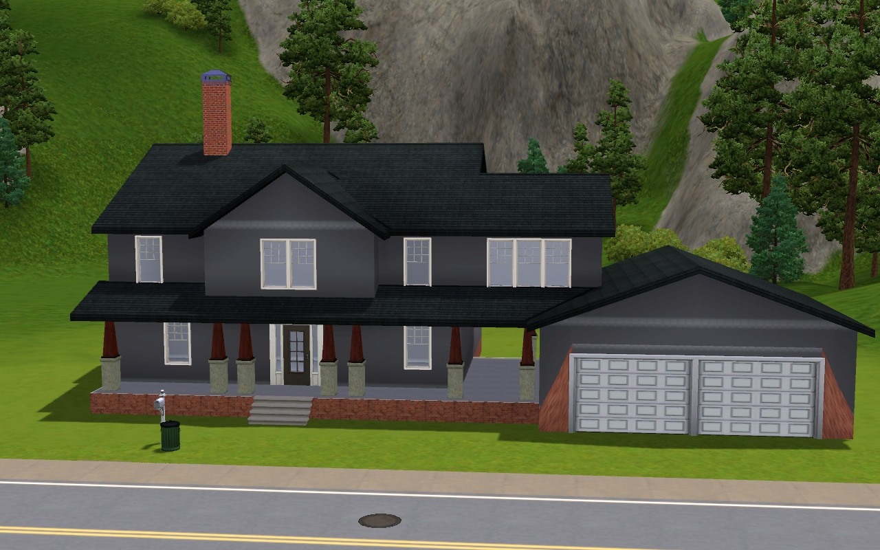
Default Green and Brick house
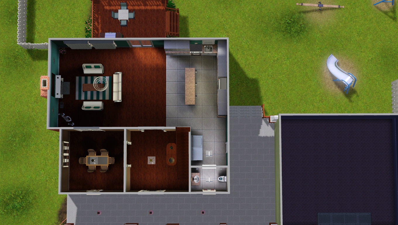
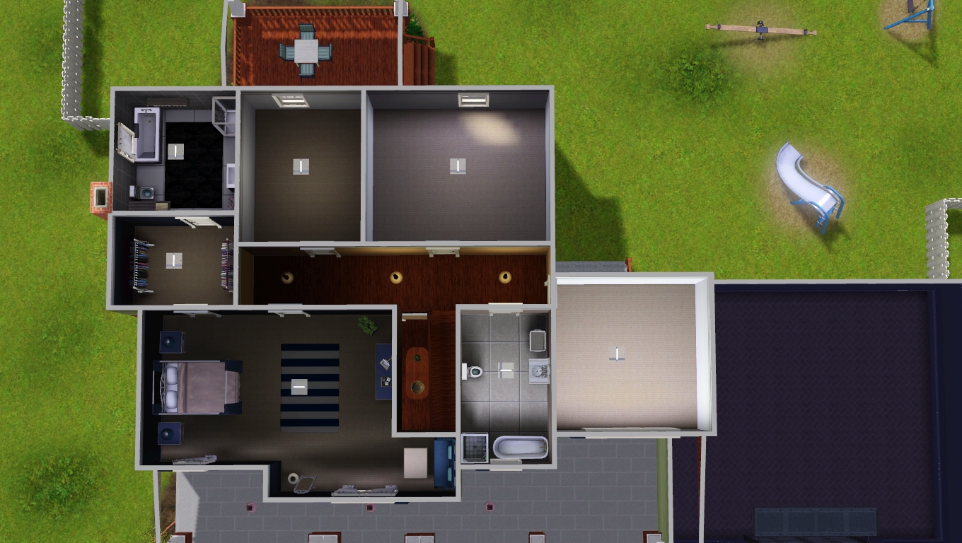
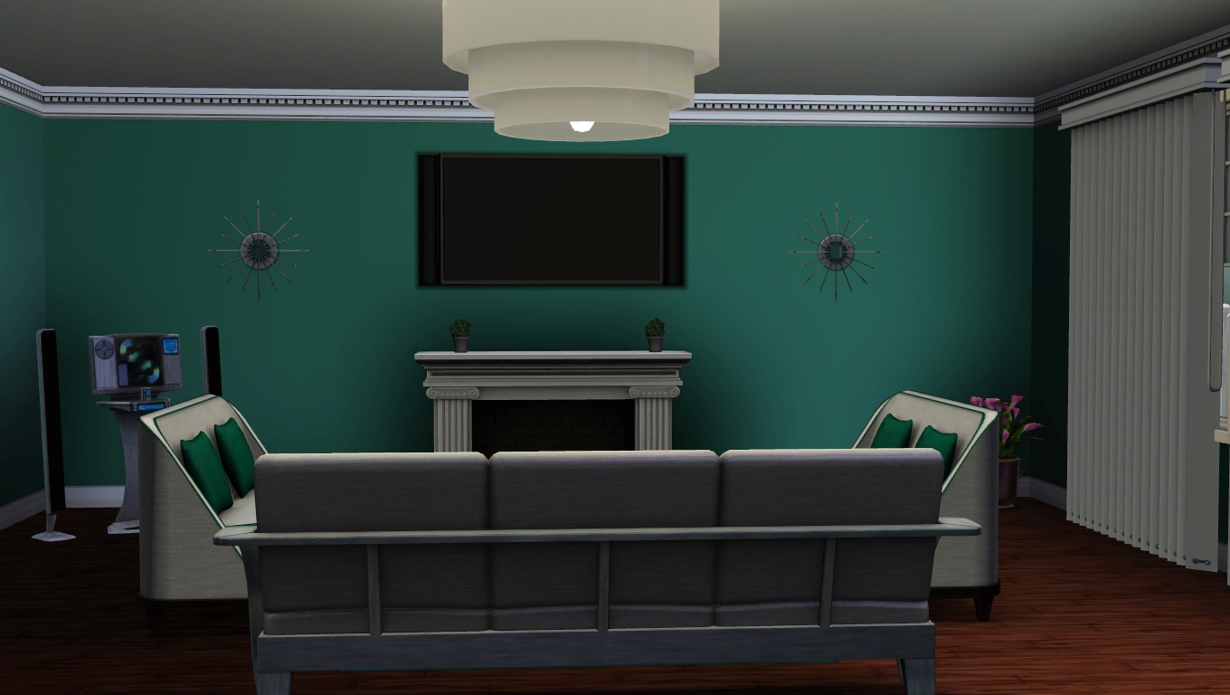
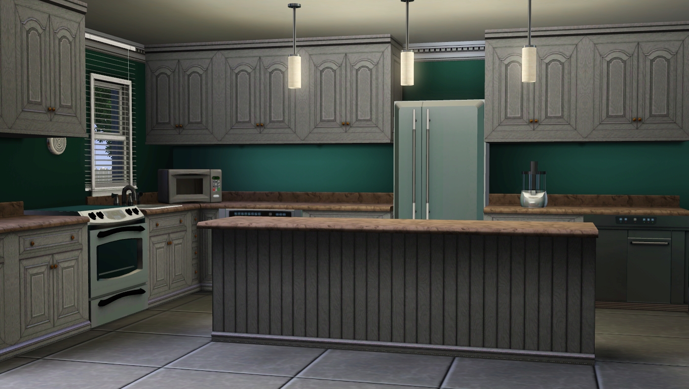
This is a house i have been working on for awhile and i would really appreciate feedback before i attempt to upload it.


Thanks is advance for your help and feedback

(P.S i could also use some help thinking of a better name to call it )

Edit:I really hope this look good now. I'm sorta getting tired of this house because its been like 2 weeks or something close to that
Advertisement
Scholar
#2 Old 27th Apr 2014 at 10:50 PM
It looks really good, although I'd suggest changing the colour of the pathway leading up to the front of the house and making more realistic, perhaps by making it a bit darker?
Alchemist
#3 Old 27th Apr 2014 at 10:55 PM
What Fergus said.
Looks very traditional. I'd suggest dirt terrain paint under bushes and trees, and also under the swingset and such. Maybe make the master bedroom a tad smaller and remove the wall next to the staircase so you have an 'overview' of the downstairs entry. Perhaps put a sofa and seat in the master seating corner instead of one seat only, if you decide to not resize the master bedroom.

I come in peace
__________
Need help building? We'll help.
Test Subject
Original Poster
#4 Old 27th Apr 2014 at 11:46 PM
I have dirt paint under the plants, but I will add it under the swing. I will also change the entry path. The wall next to the stairs is kinda "hiding"wall to cover up the ugly stairs. I didn't use a cheat to make an L stair just used a platform and it doesn't look the nicest, but I didn't want to go through the trouble of making a real L stair because of the hassle I had with the garage. I appreciate the feed back on everything, but the master bedroom I kinda liked. I am thinking about rearranging it and adding more elements to it, and hopefully it will look nicer then.

I'm just gonna forget the L stair and make it normal
Test Subject
Original Poster
#5 Old 28th Apr 2014 at 12:39 AM
also i did try to dirt under all of the play ground items but it didn't look good so i just used it under the swing
Scholar
#6 Old 28th Apr 2014 at 4:41 AM
Interesting house! Good job! I think that you could take one tile away on either side of the garage doors to make the garage smaller. For the siding on the garage, maybe something vertical or a plaster type siding that won't show the CFE work used to make the attached garage. Maybe have the entrance from the garage into the kitchen rather than the laundry room. The dining room is quite far from the kitchen but I'm not sure how to suggest rearranging at this point without some major re-working. Looking forward to an update!
Inventor
#7 Old 28th Apr 2014 at 3:31 PM
I like the front of the house and the floorplan. Good work so far. What bothers me a bit is that the front of the garage looks so huge compared to the house itself. What SimmyRN said might help to make the garage look smaller.

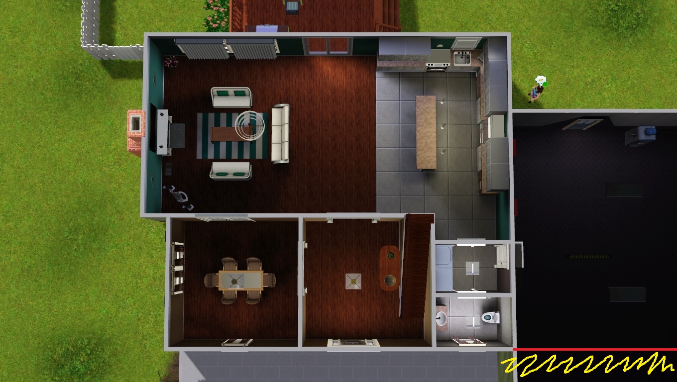
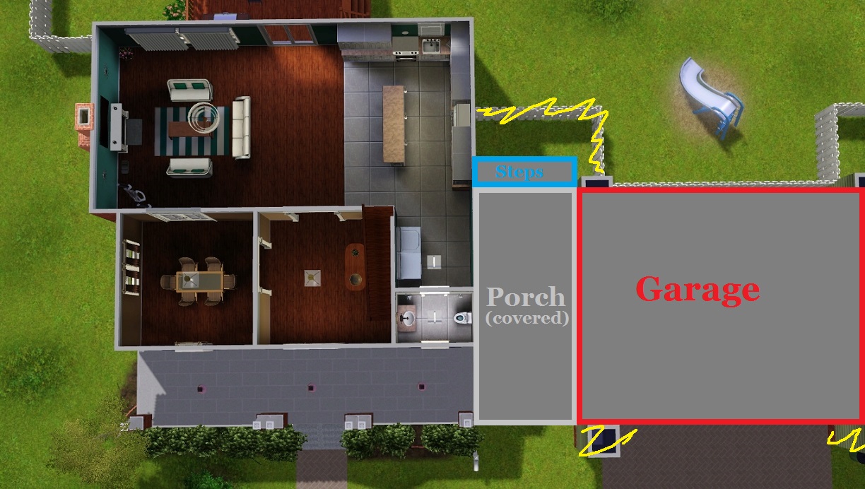
You could also create a small gap between house and garage (1-2 tiles wide, see green part in picture) far up to the part with the door. For that small part of the wall that is a little stretched due to the use of cfe, you could use a different pattern that makes the cfe less visible (see red line), the rest of the garage could keep the pattern as you don't need to repeat the lower part of cfe there, you only need it on the left side which is attached to the house.

Doh! Sorry for my english - I'm not sure if it makes sense to you what I said. I barely can understand it myself....
Screenshots
Scholar
#8 Old 28th Apr 2014 at 5:35 PM
How about "The Perry House" for its name? Or "Perry View"?
Instructor
#9 Old 28th Apr 2014 at 7:28 PM
I agree with Yogi-tea that the garage is too huge. I think that it would look much better if you make it smaller with only one garage door. The house itself is very pretty.
Scholar
#10 Old 28th Apr 2014 at 7:43 PM Last edited by Fergus' Mind : 28th Apr 2014 at 7:59 PM.
I must admit, paying it more attention, the garage does seem too big. Maybe you could extent the upper floor of the house out over the garage if you don't want to reduce its size?
Maybe like one of these:


Or if you're willing to reduce the size of the garage, maybe cut it back to being in line with the front of the house, like so:

Mind you, the house is so cute that it might look better without the garage or with a smaller garage separate from the house, or maybe even a single garage on the right hand side of the double drive and another parking space where the other half of the garage used to be.
Screenshots
Test Subject
Original Poster
#11 Old 28th Apr 2014 at 8:18 PM
ok, so changed my mind, taking the garage off. This poor house is becoming a mess so im just gonna take the hassle away. working on pictures... hope it looks ok without it lol
Test Subject
Original Poster
#12 Old 28th Apr 2014 at 8:56 PM
Thanks fergus' mind for the name feedback. think i really like Perry View
Scholar
#13 Old 28th Apr 2014 at 11:27 PM
Hmm, I think a proper garage looked better. Maybe you could make the porch wrap around the side of the house and connect to the garage? Like so:
Screenshots
Test Subject
Original Poster
#14 Old 29th Apr 2014 at 12:25 AM
Quote: Originally posted by Fergus' Mind
Hmm, I think a proper garage looked better. Maybe you could make the porch wrap around the side of the house and connect to the garage? Like so:


Hmm never thought of that. I'll try it when I get a chance
Scholar
#15 Old 29th Apr 2014 at 3:31 AM
Right now, the home is a little off balance because the left side is 4 tiles and the right is 3, and the door and dormer are almost centered but not quite. I'd either center them, or make them purposely off center.

Sarcasm is a body's natural defense against stupid.
Scholar
#16 Old 29th Apr 2014 at 8:46 AM
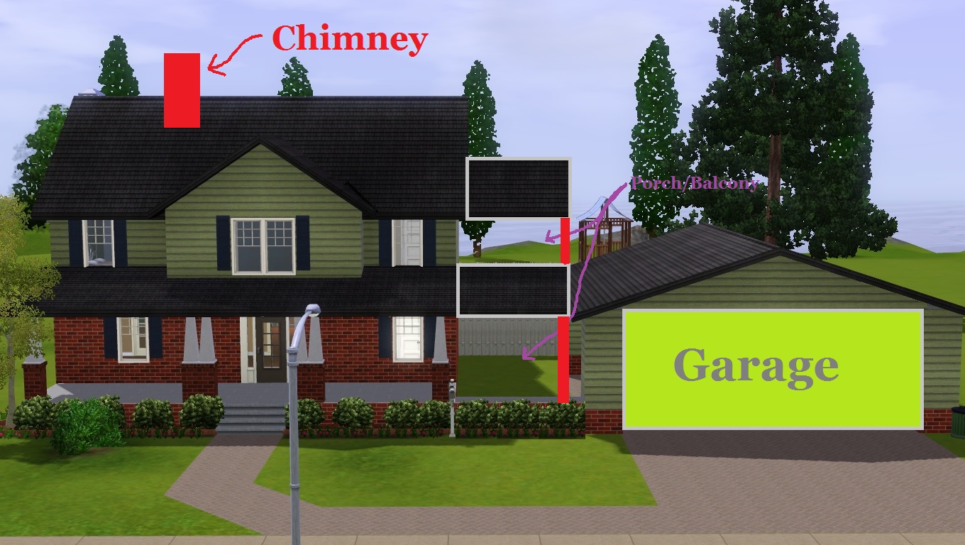
You could then have a covered balcony above upstairs between the house and garage like so:

And maybe you could add a chimney too?
Screenshots
Test Subject
Original Poster
#17 Old 29th Apr 2014 at 5:53 PM
Btw I did edit the house again and replaced the pictures
Scholar
#18 Old 30th Apr 2014 at 8:38 PM
Personally, I would have kept the roof of the porch at the height/pitch it was and also as the half-gable rather than the half-hipped gable that you've changed it to.
Test Subject
Original Poster
#19 Old 30th Apr 2014 at 10:32 PM
Quote: Originally posted by Fergus' Mind
Personally, I would have kept the roof of the porch at the height/pitch it was and also as the half-gable rather than the half-hipped gable that you've changed it to.

i tried but i t wouldnt work. i liked the old roof better but no matter what i did or what cheat i used it just wouldnt work
Scholar
#20 Old 1st May 2014 at 12:13 AM
In what way didn't it work?
Test Subject
Original Poster
#21 Old 1st May 2014 at 1:13 AM
It kept saying that it couldn't intersect objects and I removed everything that could possibly be in it's way. I cleaned out the whole upstairs including doors and windows and it still didn't work
Test Subject
Original Poster
#22 Old 1st May 2014 at 3:38 PM
ok so after several frustrating hours i finally got the roof to work again and have updated the picture. does that look better?
Lab Assistant
#23 Old 1st May 2014 at 4:24 PM
Why don't you link the porch's roof with the garage's roof?
Scholar
#24 Old 1st May 2014 at 5:53 PM
I'd do something like this with the space between the house and the garage, that way you gain an extra bedroom:
Screenshots
Instructor
#25 Old 1st May 2014 at 6:09 PM
I agree with Fergus Mind - that would make your home look even better.
Page 1 of 2
Back to top