Hi there! You are currently browsing as a guest. Why not create an account? Then you get less ads, can thank creators, post feedback, keep a list of your favourites, and more!
View Poll Results: Is this lot ready to be submitted?
This Lot is ready
0 0%
Exterior need improvement
2 33.33%
Interior need improvement
2 33.33%
The colour used is not suitable
4 66.67%
Multiple Choice Poll. Voters: 6. You may not vote on this poll

Test Subject
Original Poster
#1 Old 23rd Dec 2014 at 6:17 AM Last edited by funkydude63 : 26th Dec 2014 at 5:55 AM.
MTS first toilet-house
Ladies and gentleman, may I present you a house like no other:
A toilet house

It is a house based/inspired on a toilet, not a toilet becoming a house.
Lot name: Bargain John Toilet House
Size: 30x40
Targeting rich families
Modern

Previously I tried to submit in MTS but the moderator rejected it due to poor architecture, and CAST where they said the colours are not appropriate. They also said it needs improvement in interior design. So here is the preview of the improved version of the Bargain John Toilet House 2.0

The living area, dining and kitchen had just been renovated. They are no longer blue and green. They are now black and champagne gold for more luxurious looks. Refer to post no. 12.
Advertisement
Scholar
#2 Old 23rd Dec 2014 at 8:08 PM
Externally, I think the house looks great; I'd just be tempted to paint the handrails white/cream to match the rest of the house.
Internally, some of the colour schemes are a bit too bright and in your face, especially the yellow and black bathroom and the green and blue living rooms. I'd maybe try using blinds instead of curtains as the ones you've used don't really seem to fit.
Additionally, I think it's a good idea to never just place an object straight out of the catalogue and think it looks great. I always try to make sure I CAST everything that I place, that way I'm really thinking about how each aspect looks and how it fits in with everything around it.
Scholar
#3 Old 23rd Dec 2014 at 10:27 PM Last edited by tsyokawe : 25th Dec 2014 at 1:02 PM.
Regarding screenshot 88: I think you need to CASt those lampshades; there's not enough red in that room.

I agree with Fergie. I think that a house like this, with its modern lines,
might look better with blinds and such rather than curtains. (Or no window accessories at all...let the framing of the windows do the work.)

edited to add: My first sentence in this post reads kinda mean to me. I never meant that to be mean - red is my favorite colour...seriously. I love bright colours, and I'm guessing you do too.

When putting colour into a realistic house, though, you have to consider what colours do to people...how people will react to them. You need to pretend that you are a Sim walking through the rooms you've built and decorated.

Some of your colour choices practically fluoresce, and if that's the effect you're striving for, you've matched them well. But if that's the case, then it's always good idea to explain the whys and wherefores to the moderator (and would-be downloaders) in your Upload Text.

Otherwise, bright colour combinations do go a long way, and should probably be used sparingly or balanced heavily with something neutral. For example, blue and green can be gorgeous together, but too much of it in a confined space (at least IRL) might result in a few of your guests finding excuses to leave.
Test Subject
Original Poster
#4 Old 24th Dec 2014 at 3:11 AM
Thank you for the opinions. But I would like to hear a recommended colour scheme for the bathroom located on the 1st floor. Any suggestions?
Besides that try to suggest how the interior and exterior can be improved. Finally, the MTS moderator also said the long hallway can cause sims to get stuck and affect playability. Sorry for missing out that point. Any solution?

Lastly, I would like to thank Fergie for suggesting me to CAST instead of using the colours from the catalog, and both of you guys for the blinds suggestion.
Instructor
#5 Old 24th Dec 2014 at 3:14 AM
Honestly, I don't quite see where the "toilet" reference is. And BTW, the rooms have rather different colour schemes, so it's up to you whether to make them more coherent. Eg Yellow + black toiler & green living room????

Some furniture doesn't look quite modern to me.

Perhaps you need some more work on the pool area. Use ALT key to place the loungers again for a more natural look.
I must say I have OCD - I must CAST everything. But that's really up to you. I'd say that at least you need to CAST the pool loun ge furniture to make the area coherent with the rest of the design.

Keep up your work!
Instructor
#6 Old 24th Dec 2014 at 8:15 AM Last edited by Tigerdyhr : 25th Dec 2014 at 8:29 AM.
@SimsMatthew The house is shaped like a toilet, when you see it from above...

I agree with what's already been said. I don't have suggestions for colors, they should be your choice. But maybe go for something less ... aggresive. It might be as simple as to de-saturate it. But you can't really tell before you try it.

I suppose the hallway issue is in case you fill up the house, then the sims might get in each others way. I often play with hallways like that, and have not had any issues, but then I rarely play more than two, so I've never had the issue.
Edit: Ah, Splad has explained further - so it's not a routing issue at all
Instructor
#7 Old 24th Dec 2014 at 9:50 AM
Uhhhmmm.... am I lacking in creativity??? I can't see a toilet at all
*goes for an eyesight check* *hides in a hole*
Instructor
#8 Old 24th Dec 2014 at 11:34 AM
Quote: Originally posted by SimsMatthew
Uhhhmmm.... am I lacking in creativity??? I can't see a toilet at all
*goes for an eyesight check* *hides in a hole*


Haha - how about in screenshot 75? Do you see it? The pool is like a *splosh* up from the toilet ...
is going to be a cat when she grows up.
retired moderator
#9 Old 24th Dec 2014 at 5:17 PM
Quote: Originally posted by funkydude63
Finally, the MTS moderator also said the long hallway can cause sims to get stuck and affect playability.


Just an FYI ... the rubric about "hallways" can be referencing a hallway that is too cluttered and bound to cause routing issues, OR a hallway that is long, empty, and desolate. We certainly don't expect you to have music studios or athletic equipment in your hallways, but if your hallway is literally a long walk to a bedroom, you might want to consider shortening it! :D

Strangers in a Strange Land--The Shin Yi Legacy | last updated 3.7.2014
My Simblr | Is probably NSFW
Scholar
#10 Old 24th Dec 2014 at 7:44 PM
Quote: Originally posted by funkydude63
Thank you for the opinions. But I would like to hear a recommended colour scheme for the bathroom located on the 1st floor. Any suggestions?

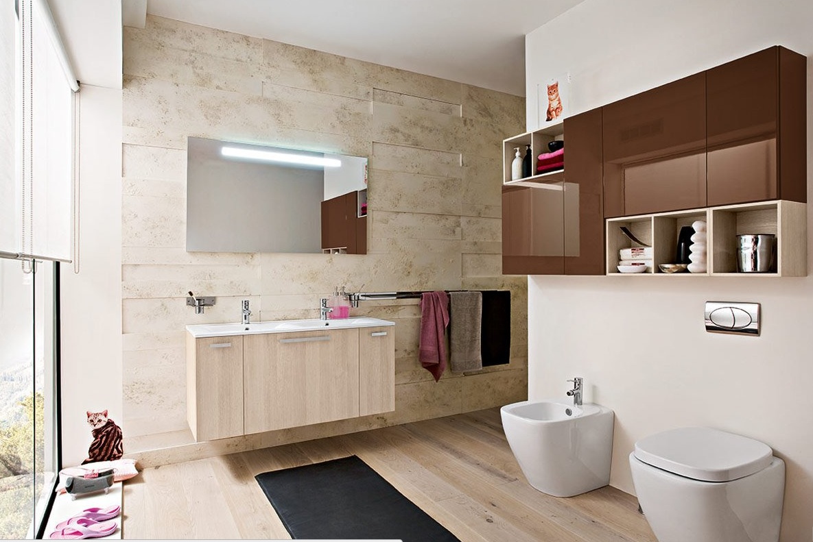
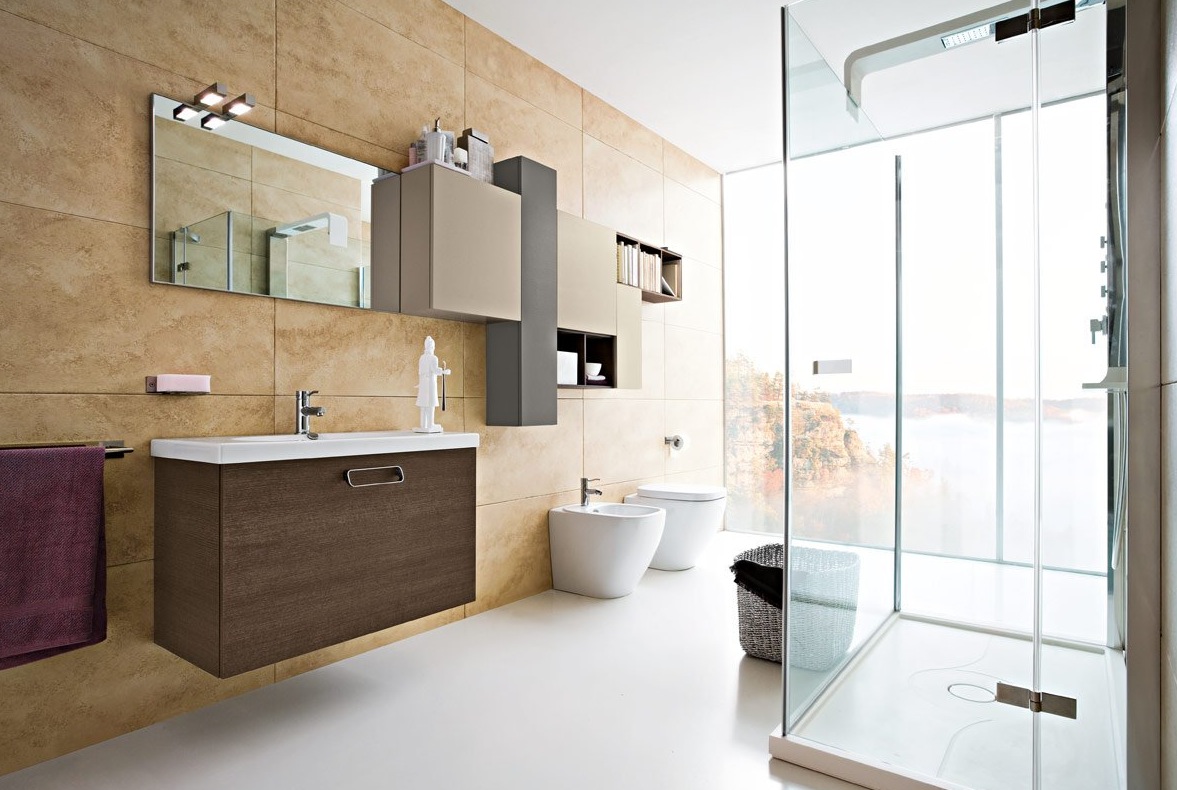
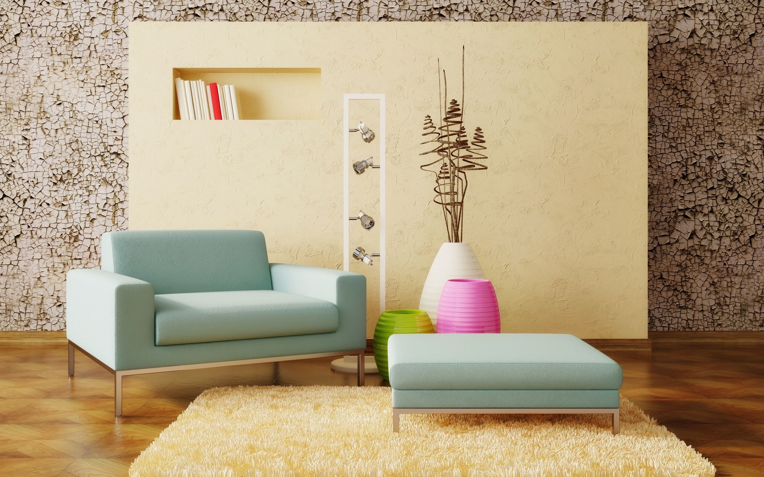
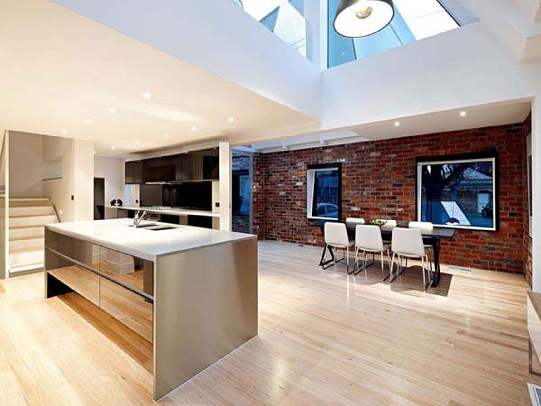
It is a very modern house from the exterior, so internally it should probably be equally sleek and modern, so maybe go with white/neutral walls and use furniture with various patterns and wall hangings to add the colour to the rooms.
Maybe something like these for the bathroom:

And then something like these for the living rooms:

And then, if you're looking for more inspiration/suggestions, maybe these for the bedrooms:

And the kitchen;

I hope these help. They're just suggestions for colour/style, feel free to ignore them.
Scholar
#11 Old 25th Dec 2014 at 1:18 PM Last edited by tsyokawe : 25th Dec 2014 at 1:30 PM.
@funkydude63 :
Quote: Originally posted by funkydude63
Thank you for the opinions. But I would like to hear a recommended colour scheme for the bathroom located on the 1st floor. Any suggestions?


Gold and black are great together, but it might be easier on the eyes if you used a less saturated gold (something nearly beige...like #fcf2d4. Also, if you're going for drama, I'd use black for the porcelain fixtures in that room. And I'd make the floor either one colour or the other (in this case).

When deliberately combining two contrasting colours, I've found more success using a 2:1 ratio.

Or, when the colours are vivid, (that would include any colour combination that includes black),
I try to scale it back further with a 5:1 ratio, 9:1 ratio, etc.

Quote: Originally posted by funkydude63
Finally, the MTS moderator also said the long hallway can cause sims to get stuck and affect playability. Sorry for missing out that point. Any solution?


Long hallways can be tricky - sometimes my sims forget why they started the trek.

If you want to keep the long hallway, you might consider camouflaging it as something else. If it's inside, put up wall decor and sculptures with the odd chair against the wall, and it becomes a gallery. If it's outside, perhaps some potted plants with a bench or two, and it becomes a porch.
Test Subject
Original Poster
#12 Old 26th Dec 2014 at 5:51 AM Last edited by funkydude63 : 29th Dec 2014 at 5:48 AM.
Hello everybody!
I've been working hard on CASTing a lot of rooms, and here is the newly renovated living room(tv area) and more!
Scholar
#13 Old 26th Dec 2014 at 11:32 PM
Like the color scheme! It would be interesting to see a pattern - gold/black, gold/white, gold/tan, or any of those plus black - on the couch cushions or curtains. For taking pictures, I've found it easiest to send all the sims to a community lot and then go to camera mode to shoot pictures. For shots like the one above, it works well for me to put the walls into "dropped wall" mode. I hope that makes sense and helps.
Instructor
#14 Old 28th Dec 2014 at 11:05 AM
Great job! I'd suggest making the room warm but not monochromatic: maybe changing the seats to beige?

I'd also say that placing two plants is too symmetrical. Remove one. Perhaps use ALT to rotate the bar free-hand so that the whole living room looks more natural.
Test Subject
Original Poster
#15 Old 29th Dec 2014 at 5:38 AM Last edited by funkydude63 : 29th Dec 2014 at 11:34 AM.
Great tip, simsmatthew!
Post no.12 has been edited for more screenshots

And here is the main question:
Is it ready?
Back to top